Introduction
![Python Data Visualization with Matplotlib]()
Visualizing data trends is one of the most important tasks in data science and machine learning. The choice of data mining and machine learning algorithms depends heavily on the patterns identified in the dataset during data visualization phase. In this article, we will see how we can perform different types of data visualizations in Python. We will use Python's Matplotlib library which is the de facto standard for data visualization in Python.
The article A Brief Introduction to Matplotlib for Data Visualization provides a very high level introduction to the Matplot library and explains how to draw scatter plots, bar plots, histograms etc. In this article, we will explore more Matplotlib functionalities.
Changing Default Plot Size
The first thing we will do is change the default plot size. By default, the size of the Matplotlib plots is 6 x 4 inches. The default size of the plots can be checked using this command:
import matplotlib.pyplot as plt

print(plt.rcParams.get('figure.figsize'))
For a better view, may need to change the default size of the Matplotlib graph. To do so you can use the following script:
fig_size = plt.rcParams["figure.figsize"]
fig_size[0] = 10
fig_size[1] = 8
plt.rcParams["figure.figsize"] = fig_size
The above script changes the default size of the Matplotlib plots to 10 x 8 inches.
Let's start our discussion with a simple line plot.
Line Plot
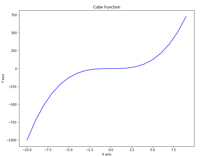
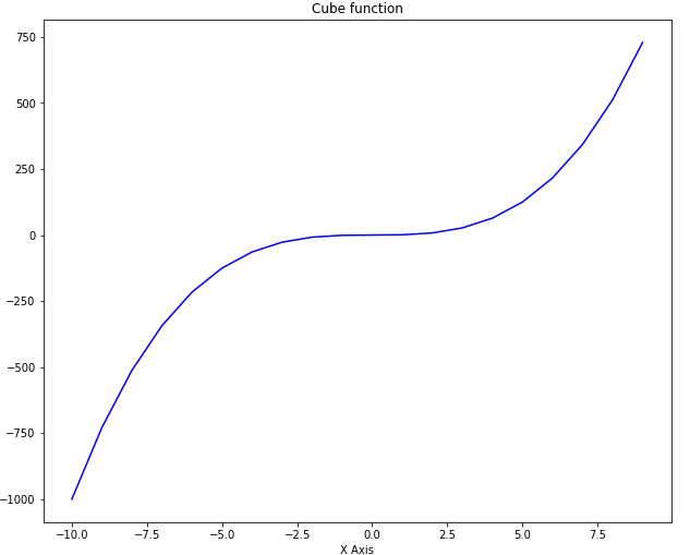
Line plot is the most basic plot in Matplotlib. It can be used to plot any function. Let's plot line plot for the cube function. Take a look at the following script:
import matplotlib.pyplot as plt
import numpy as np

x = np.linspace(-10, 9, 20)

y = x ** 3

plt.plot(x, y, 'b')
plt.xlabel('X axis')
plt.ylabel('Y axis')
plt.title('Cube Function')
plt.show()
In the script above we first import the pyplot class from the Matplotlib library. We have two numpy arrays x and y in our script. We used the linspace method of the numpy library to create list of 20 numbers between -10 to positive 9. We then take cube root of all the number and assign the result to the variable y. To plot two numpy arrays, you can simply pass them to the plot method of the pyplot class of the Matplotlib library. You can use the xlabel, ylabel and title attributes of the pyplot class in order to label the x axis, y axis and the title of the plot. The output of the script above looks likes this:
Output:
![Python Data Visualization with Matplotlib]()
Creating Multiple Plots
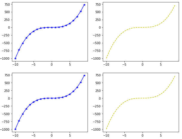
You can actually create more than one plots on one canvas using Matplotlib. To do so, you have to use the subplot function which specifies the location and the plot number. Take a look at the following example:
import matplotlib.pyplot as plt
import numpy as np
x = np.linspace(-10, 9, 20)

y = x ** 3

plt.subplot(2,2,1)
plt.plot(x, y, 'b*-')
plt.subplot(2,2,2)
plt.plot(x, y, 'y--')
plt.subplot(2,2,3)
plt.plot(x, y, 'b*-')
plt.subplot(2,2,4)
plt.plot(x, y, 'y--')
The first attribute to the subplot function is the rows that the subplots will have and the second parameter species the number of columns for the subplot. A value of 2,2 species that there will be four graphs. The third argument is the position at which the graph will be displayed. The positions start from top-left. Plot with position 1 will be displayed at first row and first column. Similarly, plot with position 2 will be displayed in first row and second column.
Take a look at the third argument of the plot function. This argument defines the shape and color of the marker on the graph.
Output:
![Python Data Visualization with Matplotlib]()
Plotting in Object-Oriented Way
In the previous section we used the plot method of the pyplot class and pass it values for x and y coordinates along with the labels. However, in Python the same plot can be drawn in object-oriented way. Take a look at the following script:
import matplotlib.pyplot as plt
import numpy as np

x = np.linspace(-10, 9, 20)

y = x ** 3

figure = plt.figure()

axes = figure.add_axes([0.2, 0.2, 0.8, 0.8])
The figure method called using pyplot class returns figure object. You can call add_axes method using this object. The parameters passed to the add_axes method are the distance from the left and bottom of the default axis and the width and height of the axis, respectively. The value for these parameters should be mentioned as a fraction of the default figure size. Executing the above script creates an empty axis as shown in the following figure:
The output of the script above looks like this:
![Python Data Visualization with Matplotlib]()
We have our axis, now we can add data and labels to this axis. To add the data, we need to call the plot function and pass it our data. Similarly, to create labels for x-axis, y-axis and for the title, we can use the set_xlabel, set_ylabel and set_title functions as shown below:
import matplotlib.pyplot as plt
import numpy as np

x = np.linspace(-10, 9, 20)

y = x ** 3

figure = plt.figure()

axes = figure.add_axes([0.2, 0.2, 0.8, 0.8])

axes.plot(x, y, 'b')
axes.set_xlabel('X Axis')
axes.set_ylabel('Y Axis')
axes.set_title('Cube function')
![Python Data Visualization with Matplotlib]()
You can see that the output is similar to the one we got in the last section but this time we used the object-oriented approach.
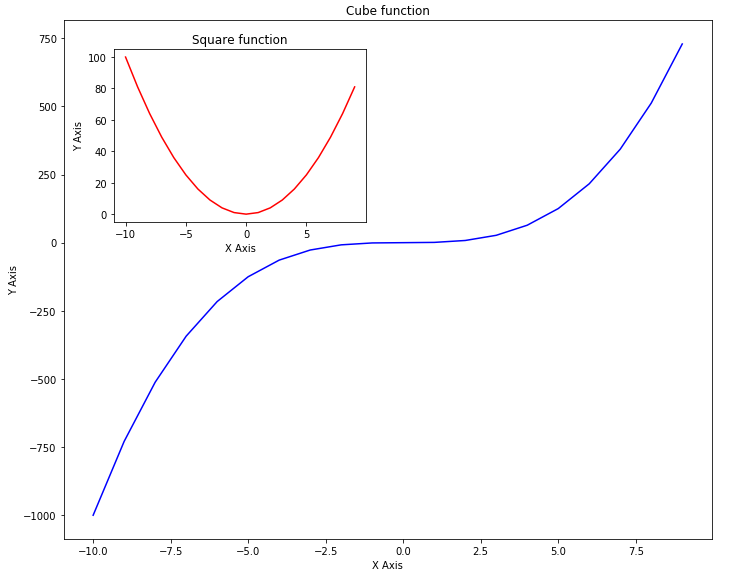
You can add as many axes as you want on one plot using the add_axes method. Take a look at the following example:
import matplotlib.pyplot as plt
import numpy as np

x = np.linspace(-10, 9, 20)

y = x ** 3

z = x ** 2

figure = plt.figure()

axes = figure.add_axes([0.0, 0.0, 0.9, 0.9])
axes2 = figure.add_axes([0.07, 0.55, 0.35, 0.3]) # inset axes

axes.plot(x, y, 'b')
axes.set_xlabel('X Axis')
axes.set_ylabel('Y Axis')
axes.set_title('Cube function')

axes2.plot(x, z, 'r')
axes2.set_xlabel('X Axis')
axes2.set_ylabel('Y Axis')
axes2.set_title('Square function')
Take a careful look at the script above. In the script above we have two axes. The first axis contains graphs of the cube root of the input while the second axis draws the graph of the square root of the same data within the other graph for cube axis.
In this example, you will better understand the role of the parameters for left, bottom, width and height. In the first axis, the values for left and bottom are set to zero while the value for width and height are set to 0.9 which means that our outer axis will have 90% width and height of the default axis.
For the second axis, the value of the left is set to 0.07, for the bottom it is set to 0.55, while width and height are 0.35 and 0.3 respectively. If you execute the script above, you will see a big graph for cube function while a small graph for a square function which lies inside the graph for the cube. The output looks like this:
![Python Data Visualization with Matplotlib]()
Subplots
Another way to create more than one plots at a time is to use subplot method. You need to pass the values for the nrow and ncols parameters. The total number of plots generated will be nrow x ncols. Let's take a look at a simple example. Execute the following script:
import matplotlib.pyplot as plt
import numpy as np
x = np.linspace(-10, 9, 20)
y = x ** 3
z = x ** 2
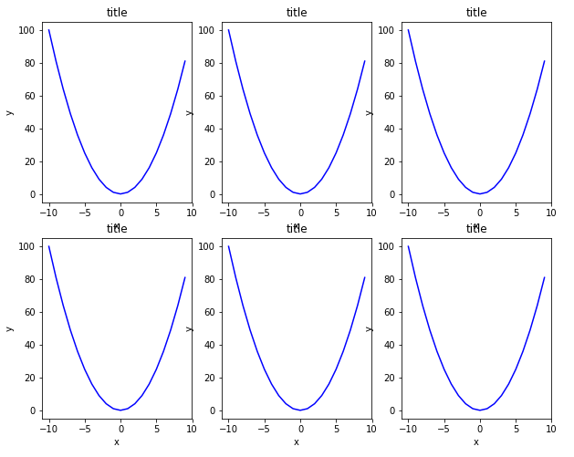
fig, axes = plt.subplots(nrows=2, ncols=3)
In the output you will see 6 plots in 2 rows and 3 columns as shown below:
![Python Data Visualization with Matplotlib]()
Next, we will use a loop to add the output of the square function to each of these graphs. Take a look at the following script:
import matplotlib.pyplot as plt
import numpy as np
x = np.linspace(-10, 9, 20)

z = x ** 2

figure, axes = plt.subplots(nrows=2, ncols=3)

for rows in axes:
    for ax1 in rows:
        ax1.plot(x, z, 'b')
        ax1.set_xlabel('X - axis')
        ax1.set_ylabel('Y - axis')
        ax1.set_title('Square Function')
In the script above, we iterate over the axes returned by the subplots function and display the output of the square function on each axis. Remember, since we have axes in 2 rows and three columns, we have to execute a nested loop to iterate through all the axes. The outer for loop iterates through axes in rows while the inner for loop iterates through the axis in columns. The output of the script above looks likes this:
![Python Data Visualization with Matplotlib]()
In the output, you can see all the six plots with square functions.
In addition to changing the default size of the graph, you can also change the figure size for specific graphs. To do so, you need to pass a value for the figsize parameter of the subplots function. The value for the figsize parameter should be passed in the form of a tuple where the first value corresponds to the width while the second value corresponds to the hight of the graph. Look at the following example to see how to change the size of a specific plot:
import matplotlib.pyplot as plt
import numpy as np
x = np.linspace(-10, 9, 20)
y = x ** 3
z = x ** 2
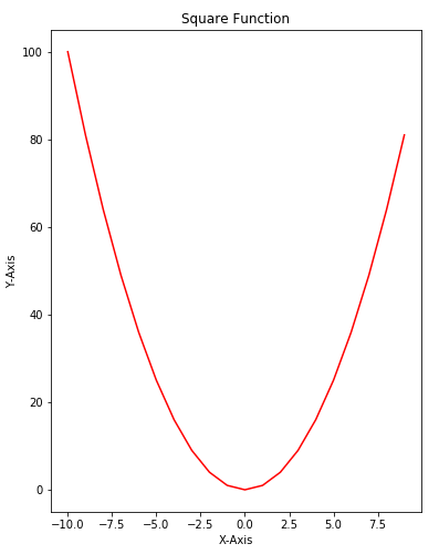
figure, axes = plt.subplots(figsize = (6,8))
axes.plot(x, z, 'r')
axes.set_xlabel('X-Axis')
axes.set_ylabel('Y-Axis')
axes.set_title('Square Function')
In the script above draw a plot for the square function that is 6 inches wide and 8 inches high. The output looks likes this:
![Python Data Visualization with Matplotlib]()
Adding Legends
Adding legends to a plot is very straightforward using Matplotlib library. All you have to do is to pass the value for the label parameter of the plot function. Then after calling the plot function, you just need to call the legend function. Take a look at the following example:
import matplotlib.pyplot as plt
import numpy as np

x = np.linspace(-10, 9, 20)

y = x ** 3

z = x ** 2

figure = plt.figure()

axes = figure.add_axes([0,0,1,1])

axes.plot(x, z, label="Square Function")
axes.plot(x, y, label="Cube Function")
axes.legend()
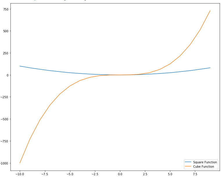
In the script above we define two functions: square and cube using x, y and z variables. Next, we first plot the square function and for the label parameter, we pass the value Square Function. This will be the value displayed in the label for square function. Next, we plot the cube function and pass Cube Function as value for the label parameter. The output looks likes this:
![Python Data Visualization with Matplotlib]()
In the output, you can see a legend at the top left corner.
The position of the legend can be changed by passing a value for loc parameter of the legend function. The possible values can be 1 (for the top right corner), 2 (for the top left corner), 3 (for the bottom left corner) and 4 (for the bottom right corner). Let's draw a legend at the bottom right corner of the plot. Execute the following script:
import matplotlib.pyplot as plt
import numpy as np

x = np.linspace(-10, 9, 20)

y = x ** 3

z = x ** 2

figure = plt.figure()

axes = figure.add_axes([0,0,1,1])

axes.plot(x, z, label="Square Function")
axes.plot(x, y, label="Cube Function")
axes.legend(loc=4)
Output:
![Python Data Visualization with Matplotlib]()
Color Options
There are several options to change the color and styles of the plots. The simplest way is to pass the first letter of the color as the third argument as shown in the following script:
import matplotlib.pyplot as plt
import numpy as np
x = np.linspace(-10, 9, 20)
y = x ** 3
z = x ** 2
figure = plt.figure()
axes = figure.add_axes([0,0,1,1])
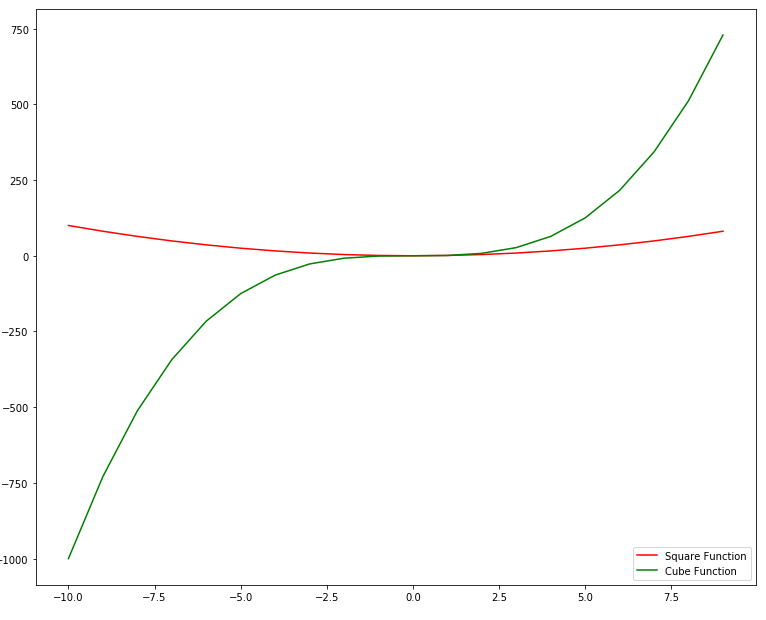
axes.plot(x, z, "r" ,label="Square Function")
axes.plot(x, y, "g", label="Cube Function")
axes.legend(loc=4)
In the script above, a string "r" has been passed as the third parameter for the first plot. For the second plot, the string "g" has been passed at the third parameter. In the output, the first plot will be printed with a red solid line while the second plot will be printed with a green solid line as shown below:
![Python Data Visualization with Matplotlib]()
Another way to change the color of the plot is to make use of the color parameter. You can pass the name of the color or the hexadecimal value of the color to the color parameter. Take a look at the following example:
import matplotlib.pyplot as plt
import numpy as np
x = np.linspace(-10, 9, 20)
y = x ** 3
z = x ** 2
figure = plt.figure()
axes = figure.add_axes([0,0,1,1])
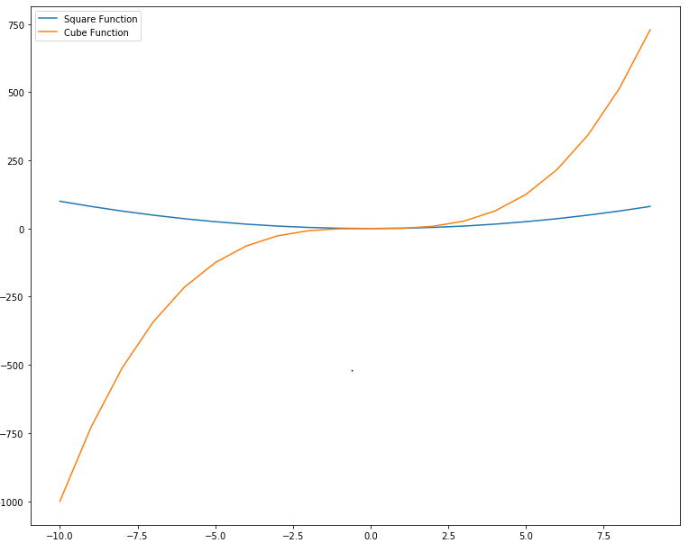
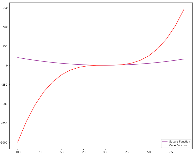
axes.plot(x, z, color = "purple" ,label="Square Function")
axes.plot(x, y, color = "#FF0000", label="Cube Function")
axes.legend(loc=4)
Output:
![Python Data Visualization with Matplotlib]()
Stack Plot
Stack plot is an extension of bar chart or line chart which breaks down data from different categories and stack them together so that comparison between the values from different categories can easily be made.
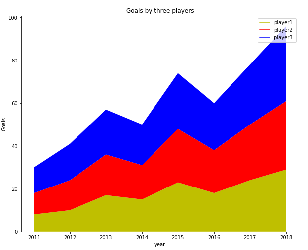
Suppose, you want to compare the goals scored by three different football players per year over the course of the last 8 years, you can create a stack plot using Matplot using the following script:
import matplotlib.pyplot as plt

year = [2011, 2012, 2013, 2014, 2015, 2016, 2017, 2018]

player1 = [8,10,17,15,23,18,24,29]
player2 = [10,14,19,16,25,20,26,32]
player3 = [12,17,21,19,26,22,28,35]

plt.plot([],[], color='y', label = 'player1')
plt.plot([],[], color='r', label = 'player2')
plt.plot([],[], color='b', label = 'player3 ')

plt.stackplot(year, player1, player2, player3, colors = ['y','r','b'])
plt.legend()
plt.title('Goals by three players')
plt.xlabel('year')
plt.ylabel('Goals')
plt.show()
Output:
![Python Data Visualization with Matplotlib]()
To create a stack plot using Python, you can simply use the stackplot class of the Matplotlib library. The values that you want to display are passed as the first parameter to the class and the values to be stacked on the horizontal axis are displayed as the second parameter, third parameter and so on. You can also set the color for each category using the colors attribute.
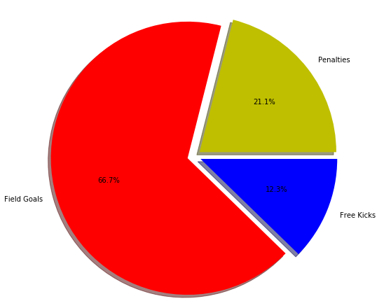
Pie Chart
A pie type is a circular chart where different categories are marked as part of the circle. The larger the share of the category, larger will be the portion that it will occupy on the chart.
Let's draw a simple pie chart of the goals scored by a football team from free kicks, penalties and field goals. Take a look at the following script:
import matplotlib.pyplot as plt

goal_types = 'Penalties', 'Field Goals', 'Free Kicks'

goals = [12,38,7]
colors = ['y','r','b']

plt.pie(goals, labels = goal_types, colors=colors ,shadow = True, explode = (0.05, 0.05, 0.05), autopct = '%1.1f%%')
plt.axis('equal')

plt.show()
Output:
![Python Data Visualization with Matplotlib]()
To create a pie chart in Matplot lib, the pie class is used. The first parameter to the class constructor is the list of numbers for each category. Comma-separated list of categories is passed as the argument to the labels attribute. List of colors for each category is passed to the colors attribute. If set to true, shadow attribute creates shadows around different categories on the pie chart. Finally, the explode attribute breaks the pie chart into individual parts.
It is important to mention here that you do not have to pass the percentage for each category; rather you just have to pass the values and percentage for pie charts will automatically be calculated.
Saving a Graph
Saving a graph is very easy in Matplotlib. All you have to do is to call the savefig method from the figure object and pass it the path of the file that you want your graph to be saved with. Take a look at the following example:
import matplotlib.pyplot as plt
import numpy as np
x = np.linspace(-10, 9, 20)

y = x ** 3

z = x ** 2

figure, axes = plt.subplots(figsize = (6,8))

axes.plot(x, z, 'r')
axes.set_xlabel('X-Axis')
axes.set_ylabel('Y-Axis')
axes.set_title('Square Function')

figure.savefig(r'E:/fig1.jpg')
The above script will save your file with name fig1.jpg at the root of the E directory.
Conclusion
Matplotlib is one of the most commonly used Python libraries for data visualization and plotting. The article explains some of the most frequently used Matplotlib functions with the help of different examples. Though the article covers most of the basic stuff, this is just the tip of the iceberg. I would suggest that you explore the official documentation for the Matplotlib library and see what more you can do with this amazing library.