Today we've issued the 2.0.7 and 1.11.14 bugfix releases.
The release package and checksums are available from our downloads page, as well as from the Python Package Index. The PGP key ID used for this release is Carlton Gibson: E17DF5C82B4F9D00.
Today we've issued the 2.0.7 and 1.11.14 bugfix releases.
The release package and checksums are available from our downloads page, as well as from the Python Package Index. The PGP key ID used for this release is Carlton Gibson: E17DF5C82B4F9D00.
The EuroPython Society (EPS), who is organizing the EuroPython conference, last year extended it’s mission to also provide help for the Python community in Europe in general.
As part of this, we would like to get to know, and help create closer ties between organizers of other European Python events.
We would like to invite representatives of all European Python conference to EuroPython 2018 to join us for an organizers’ lunch. We’re planing the lunch for Friday, July 27, in the organizer’s room (Soutra Suite).
Our aim is to get to know each other, exchange experience in organizing events and to find out how we, as EPS, can most effectively help other conferences going forward.
To support and facilitate this, we are giving out one free conference ticket per conference team, so that each team can send a representative to the organizers’ lunch.
If your team wants to send someone to join, please write to board@europython.eu, mentioning the conference you’re organizing and some background on your team.
Enjoy,
–
EuroPython Society
https://ep2018.europython.eu/
https://www.europython-society.org/
The EuroPython Society (EPS) extended its mission last year to not only run the EuroPython conference, but also provide help for the Python community in Europe in general.
In addition to the Python Organizers Lunch (see previous post), which focuses on conference organizers, we are also establishing a program to support attendees of Python user groups and conferences in Europe.
We’d like to invite all of you to EuroPython 2018 this year. Of course, we cannot give out free tickets to everyone, but we can at least recognize your participation in the Python community by giving out discounts for the conference.
If you are running a Python event (conference or user group) in Europe, please reach out to board@europython.eu to request a coupon code for your group, which you can then pass on to your group members or attendees.
If you are not running a user group or conference, but a regular attendee of one, please contact your organizers to have them submit a request. We can only distribute codes at the user group and conference organizer level.
The coupon codes are valid for conference tickets bought starting today and will give you a 10% discount on the ticket price (both regular and late bird prices). The codes are setup for user group sizes of between 30-50 members, but we are also extending this to organizers and attendees of larger conferences. If you need a code valid for larger groups, please mention this in your email.
Enjoy,
–
EuroPython Society
https://ep2018.europython.eu/
https://www.europython-society.org/
Python has many options for natively creating common Microsoft Office file types including Excel, Word and PowerPoint. In some cases, however, it may be too difficult to use the pure python approach to solve a problem. Fortunately, python has the “Python for Windows Extensions” package known as pywin32 that allows us to easily access Window’s Component Object Model (COM) and control Microsoft applications via python. This article will cover some basic use cases for this type of automation and how to get up and running with some useful scripts.
From the Microsoft Website, the Component Object Model (COM) is:
a Platform-independent, distributed, object-oriented system for creating binary software components that can interact. COM is the foundation technology for Microsoft’s OLE (compound documents) and ActiveX (Internet-enabled components) technologies. COM objects can be created with a variety of programming languages.
This technology allows us to control Windows applications from another program. Many of the readers of this blog have probably seen or used VBA for some level of automation of an Excel task. COM is the foundational technology that supports VBA.
The pywin32 package has been around for a very long time. In fact, the book
that covers this topic was published in 2000 by Mark Hammond and Andy Robinson.
Despite being 18 years old (which make me feel really old :), the underlying
technology and concepts still work today. Pywin32 is basically a very thin wrapper of
python that allows us to interact with COM objects and automate Windows applications
with python. The power of this approach is that you can pretty much do anything
that a Microsoft Application can do through python. The downside is that you have
to run this on a Windows system with Microsoft Office installed. Before we go
through some examples, make sure you have pywin32 installed on your system using
pip
or
conda
One other recommendation I would make is that you keep a link to Tim Golden’s page handy. This resource has many more details on how to use python on Windows for automation and other administration tasks.
All of these applications start with similar imports and process for activating an application. Here is a very short example of opening up Excel:
importwin32com.clientaswin32excel=win32.gencache.EnsureDispatch('Excel.Application')excel.visible=True_=input("Press ENTER to quit:")excel.Application.quit()Once you run this from the command line, you should see Excel open up. When you press ENTER, the application will close. There are a few key concepts to go through before we actually make this a more useful application.
The first step is to import the win32 client. I’ve used the convention of importing
it as
win32
to make the actual dispatch code a little shorter.
The magic of this code is using
EnsureDispatch
to launch Excel. In this example,
I use
gencache.EnsureDispatch
to create a static proxy. I recommend reading
this article if you want to know more details about static vs. dynamic proxies.
I have had good luck using this approach for the types of examples included in this article
but will be honest - I have not widely experimented with the various dispatch approaches.
Now that the excel object is launched, we need to explicitly make it visible by
setting
excel.visible = True
The win32 code is pretty smart and will close down excel once the program is done running. This means that if we just leave the code to run on its own, you probably won’t see Excel. I include the dummy prompt to keep Excel visible on the screen until the user presses ENTER.
I include the final line of
excel.Application.quit()
as a bit of a belt and
suspenders approach. Strictly speaking win32 should close out Excel when the program
is done but I decided to include
excel.Application.quit()
to show how to
force the application to close.
This is the most basic approach to using COM. We can extend this in a number of more useful ways. The rest of this article will go through some examples that might be useful for your own needs.
In my day-to-day work, I frequently use pandas to analyze and manipulate data, then output the results in Excel. The next step in the process is to open up the Excel and review the results. In this example, we can automate the file opening process which can make it simpler than trying to navigate to the right directory and open a file.
Here’s the full example:
importwin32com.clientaswin32importpandasaspdfrompathlibimportPath# Read in the remote data filedf=pd.read_csv("https://github.com/chris1610/pbpython/blob/master/data/sample-sales-tax.csv?raw=True")# Define the full path for the output fileout_file=Path.cwd()/"tax_summary.xlsx"# Do some summary calcs# In the real world, this would likely be much more involveddf_summary=df.groupby('category')['ext price','Tax amount'].sum()# Save the file as Exceldf_summary.to_excel(out_file)# Open up Excel and make it visibleexcel=win32.gencache.EnsureDispatch('Excel.Application')excel.Visible=True# Open up the fileexcel.Workbooks.Open(out_file)# Wait before closing it_=input("Press enter to close Excel")excel.Application.Quit()Here’s the resulting Excel output:
This simple example expands on the earlier one by showing how to use the
Workbooks
object to open up a file.
Another simple scenario where COM is helpful is when you want to attach a file to an email and send to a distribution list. This example shows how to do some data manipulation, open up a Outlook email, attach a file and leave it open for additional text before sending.
Here’s the full example:
importwin32com.clientaswin32importpandasaspdfrompathlibimportPathfromdatetimeimportdateto_email="""Lincoln, Abraham <honest_abe@example.com>; chris@example.com"""cc_email="""Franklin, Benjamin <benny@example.com>"""# Read in the remote data filedf=pd.read_csv("https://github.com/chris1610/pbpython/blob/master/data/sample-sales-tax.csv?raw=True")# Define the full path for the output fileout_file=Path.cwd()/"tax_summary.xlsx"# Do some summary calcs# In the real world, this would likely be much more involveddf_summary=df.groupby('category')['ext price','Tax amount'].sum()# Save the file as Exceldf_summary.to_excel(out_file)# Open up an outlook emailoutlook=win32.gencache.EnsureDispatch('Outlook.Application')new_mail=outlook.CreateItem(0)# Label the subjectnew_mail.Subject="{:%m/%d} Report Update".format(date.today())# Add the to and cc listnew_mail.To=to_emailnew_mail.CC=cc_email# Attach the fileattachment1=out_file# The file needs to be a string not a path objectnew_mail.Attachments.Add(Source=str(attachment1))# Display the emailnew_mail.Display(True)This example gets a little more involved but the basic concepts are the same.
We need to create our object (Outlook in this case) and create a new email.
One of the challenging aspects of working with COM is that there is not a very consistent
API. It is not intuitive that you create an email like this:
new_mail = outlook.CreateItem(0)
It generally takes a little searching to figure out the exact API for the specific problem.
Google and stackoverflow are your friends.
Once the email object is created, you can add the recipient and CC list as well as attach the file. When it is all said and done, it looks like this:
The email is open and you can add additional information and send it. In this example, I chose not to close out Outlook and let python handle those details.
The final example is the most involved but illustrates a powerful approach for blending the data analysis of python with the user interface of Excel.
It is possible to build complex excel with pandas but that approach can be very laborious. An alternative approach would be to build up the complex file in Excel, then do the data manipulation and copy the data tab to the final Excel output.
Here is an example of the Excel dashboard we want to create:
Yes, I know that pie charts are awful but I can almost guarantee that someone is going to ask you to put one in the dashboard at some point in time! Also, this template had a pie chart and I decided to keep it in the final output instead of trying to figure out another chart.
It might be helpful to take a step back and look at the basic process the code will follow:
Let’s get started with the code.
importwin32com.clientaswin32importpandasaspdfrompathlibimportPath# Read in the remote data filedf=pd.read_csv("https://github.com/chris1610/pbpython/blob/master/data/sample-sales-tax.csv?raw=True")# Define the full path for the data file filedata_file=Path.cwd()/"sales_summary.xlsx"# Define the full path for the final output filesave_file=Path.cwd()/"sales_dashboard.xlsx"# Define the template filetemplate_file=Path.cwd()/"sample_dashboard_template.xlsx"In the section we performed our imports, read in the data and defined all three files. Of note is that this process includes the step of summarizing the data with pandas and saving the data in an Excel file. We then re-open that file and copy the data into the template. It is a bit convoluted but this is the best approach I could figure out for this scenario.
Next we perform the analysis and save the temp Excel file:
# Do some summary calcs# In the real world, this would likely be much more involveddf_summary=df.groupby('category')['quantity','ext price','Tax amount'].sum()# Save the file as Exceldf_summary.to_excel(data_file,sheet_name="Data")Now we use COM to merge the temp output file into our Excel dashboard tab and save a new copy:
# Use com to copy the files aroundexcel=win32.gencache.EnsureDispatch('Excel.Application')excel.Visible=Falseexcel.DisplayAlerts=False# Template filewb_template=excel.Workbooks.Open(template_file)# Open up the data filewb_data=excel.Workbooks.Open(data_file)# Copy from the data file (select all data in A:D columns)wb_data.Worksheets("Data").Range("A:D").Select()# Paste into the template fileexcel.Selection.Copy(Destination=wb_template.Worksheets("Data").Range("A1"))# Must convert the path file object to a string for the save to workwb_template.SaveAs(str(save_file))The code opens up Excel and makes sure it is not visible. Then it opens up the
dashboard template and data files. It uses the
Range("A:D").Select()
to
select all the data and then copies it into the template file.
The final step is to save the template as a new file.
This approach can be a very convenient shortcut when you have a situation where you want to use python for data manipulation but need a complex Excel output. You may not have an apparent need for it now but if you ever build up a complex Excel report, this approach is much simpler than trying to code the spreadsheet by hand with python.
My preference is to try to stick with python as much as possible for my day-to-day data analysis. However, it is important to know when other technologies can streamline the process or make the results have a bigger impact. Microsoft’s COM technology is a mature technology and can be used effectively through python to do tasks that might be too difficult to do otherwise. Hopefully this article has given you some ideas on how to incorporate this technique into your own workflow. If you have any tasks you like to use pywin32 for, let us know in the comments.
In this tutorial, you’ll be equipped to make production-quality, presentation-ready Python histogram plots with a range of choices and features.
If you have introductory to intermediate knowledge in Python and statistics, you can use this article as a one-stop shop for building and plotting histograms in Python using libraries from its scientific stack, including NumPy, Matplotlib, Pandas, and Seaborn.
A histogram is a great tool for quickly assessing a probability distribution that is intuitively understood by almost any audience. Python offers a handful of different options for building and plotting histograms. Most people know a histogram by its graphical representation, which is similar to a bar graph:

This article will guide you through creating plots like the one above as well as more complex ones. Here’s what you’ll cover:
Free Bonus: Short on time? Click here to get access to a free two-page Python histograms cheat sheet that summarizes the techniques explained in this tutorial.
When you are preparing to plot a histogram, it is simplest to not think in terms of bins but rather to report how many times each value appears (a frequency table). A Python dictionary is well-suited for this task:
>>> # Need not be sorted, necessarily>>> a=(0,1,1,1,2,3,7,7,23)>>> defcount_elements(seq)->dict:... """Tally elements from `seq`."""... hist={}... foriinseq:... hist[i]=hist.get(i,0)+1... returnhist>>> counted=count_elements(a)>>> counted{0: 1, 1: 3, 2: 1, 3: 1, 7: 2, 23: 1}count_elements() returns a dictionary with unique elements from the sequence as keys and their frequencies (counts) as values. Within the loop over seq, hist[i] = hist.get(i, 0) + 1 says, “for each element of the sequence, increment its corresponding value in hist by 1.”
In fact, this is precisely what is done by the collections.Counter class from Python’s standard library, which subclasses a Python dictionary and overrides its .update() method:
>>> fromcollectionsimportCounter>>> recounted=Counter(a)>>> recountedCounter({0: 1, 1: 3, 3: 1, 2: 1, 7: 2, 23: 1})You can confirm that your handmade function does virtually the same thing as collections.Counter by testing for equality between the two:
>>> recounted.items()==counted.items()TrueTechnical Detail: The mapping from count_elements() above defaults to a more highly optimized C function if it is available. Within the Python function count_elements(), one micro-optimization you could make is to declare get = hist.get before the for-loop. This would bind a method to a variable for faster calls within the loop.
It can be helpful to build simplified functions from scratch as a first step to understanding more complex ones. Let’s further reinvent the wheel a bit with an ASCII histogram that takes advantage of Python’s output formatting:
defascii_histogram(seq)->None:"""A horizontal frequency-table/histogram plot."""counted=count_elements(seq)forkinsorted(counted):print('{0:5d}{1}'.format(k,'+'*counted[k]))This function creates a sorted frequency plot where counts are represented as tallies of plus (+) symbols. Calling sorted() on a dictionary returns a sorted list of its keys, and then you access the corresponding value for each with counted[k]. To see this in action, you can create a slightly larger dataset with Python’s random module:
>>> # No NumPy ... yet>>> importrandom>>> random.seed(1)>>> vals=[1,3,4,6,8,9,10]>>> # Each number in `vals` will occur between 5 and 15 times.>>> freq=(random.randint(5,15)for_invals)>>> data=[]>>> forf,vinzip(freq,vals):... data.extend([v]*f)>>> ascii_histogram(data) 1 +++++++ 3 ++++++++++++++ 4 ++++++ 6 +++++++++ 8 ++++++ 9 ++++++++++++ 10 ++++++++++++Here, you’re simulating plucking from vals with frequencies given by freq (a generator expression). The resulting sample data repeats each value from vals a certain number of times between 5 and 15.
Note: random.seed() is use to seed, or initialize, the underlying pseudorandom number generator (PRNG) used by random. It may sound like an oxymoron, but this is a way of making random data reproducible and deterministic. That is, if you copy the code here as is, you should get exactly the same histogram because the first call to random.randint() after seeding the generator will produce identical “random” data using the Mersenne Twister.
Thus far, you have been working with what could best be called “frequency tables.” But mathematically, a histogram is a mapping of bins (intervals) to frequencies. More technically, it can be used to approximate the probability density function (PDF) of the underlying variable.
Moving on from the “frequency table” above, a true histogram first “bins” the range of values and then counts the number of values that fall into each bin. This is what NumPy’shistogram() function does, and it is the basis for other functions you’ll see here later in Python libraries such as Matplotlib and Pandas.
Consider a sample of floats drawn from the Laplace distribution. This distribution has fatter tails than a normal distribution and has two descriptive parameters (location and scale):
>>> importnumpyasnp>>> # `numpy.random` uses its own PRNG.>>> np.random.seed(444)>>> np.set_printoptions(precision=3)>>> d=np.random.laplace(loc=15,scale=3,size=500)>>> d[:5]array([18.406, 18.087, 16.004, 16.221, 7.358])In this case, you’re working with a continuous distribution, and it wouldn’t be very helpful to tally each float independently, down to the umpteenth decimal place. Instead, you can bin or “bucket” the data and count the observations that fall into each bin. The histogram is the resulting count of values within each bin:
>>> hist,bin_edges=np.histogram(d)>>> histarray([ 1, 0, 3, 4, 4, 10, 13, 9, 2, 4])>>> bin_edgesarray([ 3.217, 5.199, 7.181, 9.163, 11.145, 13.127, 15.109, 17.091, 19.073, 21.055, 23.037])This result may not be immediately intuitive. np.histogram() by default uses 10 equally sized bins and returns a tuple of the frequency counts and corresponding bin edges. They are edges in the sense that there will be one more bin edge than there are members of the histogram:
>>> hist.size,bin_edges.size(10, 11)Technical Detail: All but the last (rightmost) bin is half-open. That is, all bins but the last are [inclusive, exclusive), and the final bin is [inclusive, inclusive].
A very condensed breakdown of how the bins are constructed by NumPy looks like this:
>>> # The leftmost and rightmost bin edges>>> first_edge,last_edge=a.min(),a.max()>>> n_equal_bins=10# NumPy's default>>> bin_edges=np.linspace(start=first_edge,stop=last_edge,... num=n_equal_bins+1,endpoint=True)...>>> bin_edgesarray([ 0. , 2.3, 4.6, 6.9, 9.2, 11.5, 13.8, 16.1, 18.4, 20.7, 23. ])The case above makes a lot of sense: 10 equally spaced bins over a peak-to-peak range of 23 means intervals of width 2.3.
From there, the function delegates to either np.bincount() or np.searchsorted(). bincount() itself can be used to effectively construct the “frequency table” that you started off with here, with the distinction that values with zero occurrences are included:
>>> bcounts=np.bincount(a)>>> hist,_=np.histogram(a,range=(0,a.max()),bins=a.max()+1)>>> np.array_equal(hist,bcounts)True>>> # Reproducing `collections.Counter`>>> dict(zip(np.unique(a),bcounts[bcounts.nonzero()])){0: 1, 1: 3, 2: 1, 3: 1, 7: 2, 23: 1}Note: hist here is really using bins of width 1.0 rather than “discrete” counts. Hence, this only works for counting integers, not floats such as [3.9, 4.1, 4.15].
Now that you’ve seen how to build a histogram in Python from the ground up, let’s see how other Python packages can do the job for you. Matplotlib provides the functionality to visualize Python histograms out of the box with a versatile wrapper around NumPy’s histogram():
importmatplotlib.pyplotasplt# An "interface" to matplotlib.axes.Axes.hist() methodn,bins,patches=plt.hist(x=d,bins='auto',color='#0504aa',alpha=0.7,rwidth=0.85)plt.grid(axis='y',alpha=0.75)plt.xlabel('Value')plt.ylabel('Frequency')plt.title('My Very Own Histogram')plt.text(23,45,r'$\mu=15, b=3$')maxfreq=n.max()# Set a clean upper y-axis limit.plt.ylim(ymax=np.ceil(maxfreq/10)*10ifmaxfreq%10elsemaxfreq+10)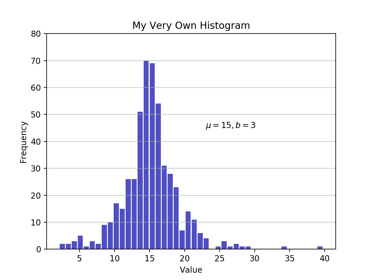
As defined earlier, a plot of a histogram uses its bin edges on the x-axis and the corresponding frequencies on the y-axis. In the chart above, passing bins='auto' chooses between two algorithms to estimate the “ideal” number of bins. At a high level, the goal of the algorithm is to choose a bin width that generates the most faithful representation of the data. For more on this subject, which can get pretty technical, check out Choosing Histogram Bins from the Astropy docs.
Staying in Python’s scientific stack, Pandas’ Series.histogram()uses matplotlib.pyplot.hist() to draw a Matplotlib histogram of the input Series:
importpandasaspd# Generate data on commute times.size,scale=1000,10commutes=pd.Series(np.random.gamma(scale,size=size)**1.5)commutes.plot.hist(grid=True,bins=20,rwidth=0.9,color='#607c8e')plt.title('Commute Times for 1,000 Commuters')plt.xlabel('Counts')plt.ylabel('Commute Time')plt.grid(axis='y',alpha=0.75)
pandas.DataFrame.histogram() is similar but produces a histogram for each column of data in the DataFrame.
In this tutorial, you’ve been working with samples, statistically speaking. Whether the data is discrete or continuous, it’s assumed to be derived from a population that has a true, exact distribution described by just a few parameters.
A kernel density estimation (KDE) is a way to estimate the probability density function (PDF) of the random variable that “underlies” our sample. KDE is a means of data smoothing.
Sticking with the Pandas library, you can create and overlay density plots using plot.kde(), which is available for both Series and DataFrame objects. But first, let’s generate two distinct data samples for comparison:
>>> # Sample from two different normal distributions>>> means=10,20>>> stdevs=4,2>>> dist=pd.DataFrame(... np.random.normal(loc=means,scale=stdevs,size=(1000,2)),... columns=['a','b'])>>> dist.agg(['min','max','mean','std']).round(decimals=2) a bmin -1.57 12.46max 25.32 26.44mean 10.12 19.94std 3.94 1.94Now, to plot each histogram on the same Matplotlib axes:
fig,ax=plt.subplots()dist.plot.kde(ax=ax,legend=False,title='Histogram: A vs. B')dist.plot.hist(density=True,ax=ax)ax.set_ylabel('Probability')ax.grid(axis='y')ax.set_facecolor('#d8dcd6')
These methods leverage SciPy’s gaussian_kde(), which results in a smoother-looking PDF.
If you take a closer look at this function, you can see how well it approximates the “true” PDF for a relatively small sample of 1000 data points. Below, you can first build the “analytical” distribution with scipy.stats.norm(). This is a class instance that encapsulates the statistical standard normal distribution, its moments, and descriptive functions. Its PDF is “exact” in the sense that it is defined precisely as norm.pdf(x) = exp(-x**2/2) / sqrt(2*pi).
Building from there, you can take a random sample of 1000 datapoints from this distribution, then attempt to back into an estimation of the PDF with scipy.stats.gaussian_kde():
fromscipyimportstats# An object representing the "frozen" analytical distribution# Defaults to the standard normal distribution, N~(0, 1)dist=stats.norm()# Draw random samples from the population you built above.# This is just a sample, so the mean and std. deviation should# be close to (1, 0).samp=dist.rvs(size=1000)# `ppf()`: percent point function (inverse of cdf — percentiles).x=np.linspace(start=stats.norm.ppf(0.01),stop=stats.norm.ppf(0.99),num=250)gkde=stats.gaussian_kde(dataset=samp)# `gkde.evaluate()` estimates the PDF itself.fig,ax=plt.subplots()ax.plot(x,dist.pdf(x),linestyle='solid',c='red',lw=3,alpha=0.8,label='Analytical (True) PDF')ax.plot(x,gkde.evaluate(x),linestyle='dashed',c='black',lw=2,label='PDF Estimated via KDE')ax.legend(loc='best',frameon=False)ax.set_title('Analytical vs. Estimated PDF')ax.set_ylabel('Probability')ax.text(-2.,0.35,r'$f(x) = \frac{\exp(-x^2/2)}{\sqrt{2*\pi}}$',fontsize=12)
This is a bigger chunk of code, so let’s take a second to touch on a few key lines:
stats subpackage lets you create Python objects that represent analytical distributions that you can sample from to create actual data. So dist = stats.norm() represents a normal continuous random variable, and you generate random numbers from it with dist.rvs().x of quantiles (standard deviations above/below the mean, for a normal distribution). stats.gaussian_kde() represents an estimated PDF that you need to evaluate on an array to produce something visually meaningful in this case.Let’s bring one more Python package into the mix. Seaborn has a displot() function that plots the histogram and KDE for a univariate distribution in one step. Using the NumPy array d from ealier:
importseabornassnssns.set_style('darkgrid')sns.distplot(d)
The call above produces a KDE. There is also optionality to fit a specific distribution to the data. This is different than a KDE and consists of parameter estimation for generic data and a specified distribution name:
sns.distplot(d,fit=stats.laplace,kde=False)
Again, note the slight difference. In the first case, you’re estimating some unknown PDF; in the second, you’re taking a known distribution and finding what parameters best describe it given the empirical data.
In addition to its plotting tools, Pandas also offers a convenient .value_counts() method that computes a histogram of non-null values to a Pandas Series:
>>> importpandasaspd>>> data=np.random.choice(np.arange(10),size=10000,... p=np.linspace(1,11,10)/60)>>> s=pd.Series(data)>>> s.value_counts()9 18318 16247 14236 13235 10894 8883 7702 5351 3470 170dtype: int64>>> s.value_counts(normalize=True).head()9 0.18318 0.16247 0.14236 0.13235 0.1089dtype: float64Elsewhere, pandas.cut() is a convenient way to bin values into arbitrary intervals. Let’s say you have some data on ages of individuals and want to bucket them sensibly:
>>> ages=pd.Series(... [1,1,3,5,8,10,12,15,18,18,19,20,25,30,40,51,52])>>> bins=(0,10,13,18,21,np.inf)# The edges>>> labels=('child','preteen','teen','military_age','adult')>>> groups,_=pd.cut(ages,bins=bins,labels=labels,retbins=True)>>> groups.value_counts()child 6adult 5teen 3military_age 2preteen 1dtype: int64>>> pd.concat((ages,groups),axis=1).rename(columns={0:'age',1:'group'}) age group0 1 child1 1 child2 3 child3 5 child4 8 child5 10 child6 12 preteen7 15 teen8 18 teen9 18 teen10 19 military_age11 20 military_age12 25 adult13 30 adult14 40 adult15 51 adult16 52 adultWhat’s nice is that both of these operations ultimately utilize Cython code that makes them competitive on speed while maintaining their flexibility.
At this point, you’ve seen more than a handful of functions and methods to choose from for plotting a Python histogram. How do they compare? In short, there is no “one-size-fits-all.” Here’s a recap of the functions and methods you’ve covered thus far, all of which relate to breaking down and representing distributions in Python:
| You Have/Want To | Consider Using | Note(s) |
|---|---|---|
| Clean-cut integer data housed in a data structure such as a list, tuple, or set, and you want to create a Python histogram without importing any third party libraries. | collections.counter() from the Python standard library offers a fast and straightforward way to get frequency counts from a container of data. | This is a frequency table, so it doesn’t use the concept of binning as a “true” histogram does. |
| Large array of data, and you want to compute the “mathematical” histogram that represents bins and the corresponding frequencies. | NumPy’s np.histogram() and np.bincount() are useful for computing the histogram values numerically and the corresponding bin edges. | For more, check out np.digitize(). |
Tabular data in Pandas’ Series or DataFrame object. | Pandas methods such as Series.plot.hist(), DataFrame.plot.hist(), Series.value_counts(), and cut(), as well as Series.plot.kde() and DataFrame.plot.kde(). | Check out the Pandas visualization docs for inspiration. |
| Create a highly customizable, fine-tuned plot from any data structure. | pyplot.hist() is a widely used histogram plotting function that uses np.histogram() and is the basis for Pandas’ plotting functions. | Matplotlib, and especially its object-oriented framework, is great for fine-tuning the details of a histogram. This interface can take a bit of time to master, but ultimately allows you to be very precise in how any visualization is laid out. |
| Pre-canned design and integration. | Seaborn’s distplot(), for combining a histogram and KDE plot or plotting distribution-fitting. | Essentially a “wrapper around a wrapper” that leverages a Matplotlib histogram internally, which in turn utilizes NumPy. |
Free Bonus: Short on time? Click here to get access to a free two-page Python histograms cheat sheet that summarizes the techniques explained in this tutorial.
You can also find the code snippets from this article together in one script at the Real Python materials page.
With that, good luck creating histograms in the wild. Hopefully one of the tools above will suit your needs. Whatever you do, just don’t use a pie chart.
[ Improve Your Python With 🐍 Python Tricks 💌 – Get a short & sweet Python Trick delivered to your inbox every couple of days. >> Click here to learn more and see examples ]
Anaconda, Inc., the most popular Python data science platform provider with 2.5 million downloads per month, is pleased to announce a new partnership with Full Spectrum Analytics, a data science consultancy that applies vast industry experience and advanced analytics capabilities to help lending businesses and retail banks leverage their own data to grow resiliently and …
Read more →
The post Anaconda and Full Spectrum Analytics Partner to Deliver Enterprise Data Science to Banks, Lenders, and Investments Firms appeared first on Anaconda.
Zato 3.0 has just been released - this is a major release that brings a lot of immensely interesting API integration features.
Zato is an enterprise open-source Python-based ESB/SOA/API integration platform and backend application server.
It is designed specifically for construction of online, mobile, IoT, middleware and backend Python systems running in banking, telecommunications, health-care, insurance, education, public administration or other environments that require integrations of multiple applications.
Highlight of the release are:
Addition of a built-in multi-protocol message broker with publish/subscribe topics and guaranteed delivery queues
Security mechanisms to help in achieving compliance with PII regulations (e.g. GDPR, HIPAA or PDPA)
IDE plugins for PyCharm and Visual Studio Code
WebSocket channels
New caching layer and Memcached connections
Automatic API documentation generation - Sphinx, OpenAPI/Swagger and WSDL
SMS messaging with Twilio
HashiCorp Vault security definitions
JSON Web Token security definitions (JWT)
Extended hot-deployment to work with static files, including JSON, XML, CSV or any other format
AMQP, ZeroMQ and IBM MQ connections can now be synchronous
New crypto mechanisms: encryption and decryption, hashing as well as generation of passwords and secrets
General performance improvements let Zato servers run up to several times faster - applies to HTTP, AMQP, ZeroMQ and IBM MQ connections
Here is the documentation, downloads and full changelog.
Through my new book, you will be able to take your Python programming skills/knowledge to the next level by developing 15+ projects from scratch. These are bite-sized projects, meaning that you can implement each one of them during a weekend. These projects will not be just throwaway projects, you will actually be able to list them in your portfolio when applying for jobs.
P.S: The final book cover might be different from this one. If you have any suggestions please let me know 
Have a great day! 
The following text is in German, since we're announcing a regional user group meeting in Düsseldorf, Germany.
Das nächste Python Meeting Düsseldorf findet an folgendem Termin statt:
04.07.2018, 18:00 Uhr
Raum 1, 2.OG im Bürgerhaus Stadtteilzentrum Bilk
Düsseldorfer Arcaden, Bachstr. 145, 40217 Düsseldorf
Wir treffen uns um 18:00 Uhr im Bürgerhaus in den Düsseldorfer Arcaden.
Das Bürgerhaus teilt sich den Eingang mit dem Schwimmbad und befindet
sich an der Seite der Tiefgarageneinfahrt der Düsseldorfer Arcaden.
Über dem Eingang steht ein großes "Schwimm’ in Bilk" Logo. Hinter der Tür
direkt links zu den zwei Aufzügen, dann in den 2. Stock hochfahren. Der
Eingang zum Raum 1 liegt direkt links, wenn man aus dem Aufzug kommt.
>>> Eingang in Google Street View
Das Python Meeting Düsseldorf ist eine regelmäßige Veranstaltung in Düsseldorf, die sich an Python Begeisterte aus der Region wendet.
Einen guten Überblick über die Vorträge bietet unser PyDDF YouTube-Kanal, auf dem wir Videos der Vorträge nach den Meetings veröffentlichen.Veranstaltet wird das Meeting von der eGenix.com GmbH, Langenfeld, in Zusammenarbeit mit Clark Consulting & Research, Düsseldorf:
Das Python Meeting Düsseldorf nutzt eine Mischung aus (Lightning) Talks und offener Diskussion.
Vorträge können vorher angemeldet werden, oder auch spontan während des Treffens eingebracht werden. Ein Beamer mit XGA Auflösung steht zur Verfügung.(Lightning) Talk Anmeldung bitte formlos per EMail an info@pyddf.de
Das Python Meeting Düsseldorf wird von Python Nutzern für Python Nutzer veranstaltet.
Da Tagungsraum, Beamer, Internet und Getränke Kosten produzieren, bitten wir die Teilnehmer um einen Beitrag in Höhe von EUR 10,00 inkl. 19% Mwst. Schüler und Studenten zahlen EUR 5,00 inkl. 19% Mwst.
Wir möchten alle Teilnehmer bitten, den Betrag in bar mitzubringen.
Da wir nur für ca. 20 Personen Sitzplätze haben, möchten wir bitten,
sich per EMail anzumelden. Damit wird keine Verpflichtung eingegangen.
Es erleichtert uns allerdings die Planung.
Meeting Anmeldung bitte formlos per EMail an info@pyddf.de
Weitere Informationen finden Sie auf der Webseite des Meetings:
http://pyddf.de/
Viel Spaß !
Marc-Andre Lemburg, eGenix.com
Over the last few weeks, our program WG has been working hard on getting the schedule all lined up. Today, we’re releasing it to the Python world.
With 140 speakers and more than 150 sessions, we have a full packed program waiting for you. Please note that the schedule may still change in details, but the overall layout is fixed now.
Please make sure you book your ticket in the coming days. We will switch to late bird rates closer to the event.
If you want to attend the training sessions, please buy a training pass. We only have very few left and will close sales for these later this week.
Since we’re close the conference and The Fringe is starting a week later, Edinburgh is in high demand. If you’re having problems finding a hotel, please also consider searching for apartments on the well known booking sites.
For traveling to Edinburgh, we suggest also considering a combination of plane and train or bus. London, Birmingham and Manchester all provide train and bus lines going to Edinburgh and by booking a combination, you can often save a lot, compared to a direct flight to Edinburgh.
Enjoy,
–
EuroPython 2018 Team
https://ep2018.europython.eu/
https://www.europython-society.org/
The field of statistics is often misunderstood, but it plays an essential role in our everyday lives. Statistics, done correctly, allows us to extract knowledge from the vague, complex, and difficult real world. Wielded incorrectly, statistics can be used to harm and mislead. A clear understanding of statistics and the meanings of various statistical measures is important to distinguishing between truth and misdirection.
We will cover the following in this article:
This article assumes no prior knowledge of statistics, but does require at least a general knowledge of Python. If you are uncomfortable with for loops and lists, I recommend covering them briefly before progressing.
We will root our discussion of statistics in real-world data, taken from Kaggle's Wine Reviews data set. The data itself comes from a scraper that scoured the Wine Enthusiast site.
For the sake of this article, let's say that you are a sommelier-in-training, a new wine taster. You found this interesting data set on wines, and you would like to compare and contrast different wines. You'll use statistics to describe the wines in the data set and derive some insights for yourself. Perhaps we can start our training with a cheap set of wines, or the most highly rated ones?
The code below loads in the data set wine-data.csv into a variable wines as list of lists. We'll perfrom statistics on wines throughout the article. You can use this code to follow along on your own computer.
import csv
with open("wine-data.csv", "r", encoding="latin-1") as f:
    wines = list(csv.reader(f))
Let's have a brief look at the first five rows of the data in table, so we can see what kinds of values we're working with.
| index | country | description | designation | points | price | province | region_1 | region_2 | variety | winery |
|---|---|---|---|---|---|---|---|---|---|---|
| 0 | US | "This tremendous 100%..." | Martha's Vineyard | 96 | 235 | California | Napa Valley | Napa | Cabernet Sauvignon | Heitz |
| 1 | Spain | "Ripe aromas of fig... | Carodorum Selecci Especial Reserva | 96 | 110 | Northern Spain | Toro | Tinta de Toro | Bodega Carmen Rodriguez | |
| 2 | US | "Mac Watson honors... | Special Selected Late Harvest | 96 | 90 | California | Knights Valley | Sonoma | Sauvignon Blanc | Macauley |
| 3 | US | "This spent 20 months... | Reserve | 96 | 65 | Oregon | Willamette Valley | Willamette Valley | Pinot Noir | Ponzi |
| 4 | France | "This is the top wine... | La Brelade | 95 | 66 | Provence | Bandol | Provence red blend | Domaine de la Begude |
This question is deceptively difficult. Statistics is many, many things, so trying to pigeonhole it into a brief summary would undoubtedly obscure some details from us, but we must start somewhere.
As an entire field, statistics can be thought of as a scientific framework for handling data. This definition includes all the tasks involved with collecting, analyzing, and interpretation of data. Statistics can also refer to individual measures that represent summaries or aspects of the data itself. Throughout the article, we will do our best to distinguish between the field and the actual measurements.
This natrually leads us to ask: but what is data? Luckily for us, data is simpler to define. Data is a general collection of observations of the world, and can be widely varied in nature, ranging from qualitative to quantitative. Researchers gather data from experiments, entrepeneurs gather data from their users, and game companies gather data on their player behavior.
These examples point out another important facet of data: observations usually pertain to a population of interest. Referring back to a previous example, a researcher may be looking at a group of patients with a particular condition. For our data, the population in question is a a set of wine reviews. The term population is pointedly vague. By clearly defining our population, we are able to perform statistics on our data and extract knowledge from them.
But why should we be interested in populations? It is useful to be able to compare and contrast populations to test our ideas about the world. We'd like to know that patients receiving a new treatment actually fare better than those receiving a placebo, but we also want to prove this quantitatively. This is where statistics comes in: giving us a rigorous way to approach data and make decisions informed by real events in the world rather than abstract guesses about it.
When we have a set of observations, it is useful to summarize features of our data into a single statement called a descriptive statistic. As their name suggests, descriptive statistics describe a particular quality of the data they summarize. These statistics fall into two general categories: the measures of central tendency and the measures of spread.
The measures of central tendency are metrics that represent an answer to the following question: "What does the middle of our data look like?" The word middle is vague because there are multiple definitions we can use to represent the middle. We'll discuss how each new measure changes how we define the middle.
The mean is a descriptive statistic that looks at the average value of a data set. While mean is the technical word, most people will understand it as just the average.
How is this the mean calculated? The picture below takes the actual equation and breaks down the calculation components into simpler terms.

In the case of the mean, the "middle" of the data set refers to this typical value. The mean represents a typical observation in our data set. If we were to pick one of our observations at random, then we're likely to get a value that's close to the mean.
The calculation of the mean is a simple task in Python. Let's figure out what the average wine score in the data set is.
# Extract all of the scores from the data set
scores = [float(w[4]) for w in wines]

# Sum up all of the scores
sum_score = sum(scores)

# Get the number of observations
num_score = len(scores)

# Now calculate the average
avg_score = sum_score/num_score
avg_score
>>> 87.8884184721394
The average score in the wine data set tells us that the "typical" score in the data set is around 87.8. This tells us that most wines in the data set are highly rated, assuming that a scale of 0 to 100. However, we must take note that the Wine Enthusiast site chooses not to post reviews where the score is below 80.
There are multiple types of means, but the this form is the most common use. This mean is referred to as the arithmetic mean since we are summing up the values of interest.
The next measure of central tendency we'll cover is the median. The median also attempts to define a typical value in the data set, but unlike mean, does not require calculation.
To find the median, we first need to reorganize our data set in ascending order. Then the median is the value that coincides with the middle of the data set. If there are an even amount of items, then we take the average of the two values that would "surround" the middle.

While Python's standard library does not support a median function, we can still find the median using the process we've described. Let's try to find the median value of the wine prices.
# Isolate prices from the data set
prices = [float(w[5]) for w in wines if w[5] != ""]

# Find the number of wine prices
num_wines = len(prices)

# We'll sort the wine prices into ascending order
sorted_prices = sorted(prices)

# We'll calculate the middle index
middle = (num_wines / 2) + 0.5

# Now we can return the median
sorted_prices[middle]
>>> 24
The median price of a wine bottle in the data set is $24. This finding suggests that at least half of the wines in the data set are sold for $24 or less. That's pretty good! What if we tried to find the mean? Given that they both represent a typical value, we would expect that they would be around the same.
sum(prices)/len(prices)
>>> 33.13
An average price of $33.13 is certainly far off from our median price, so what happened here? The difference between mean and median is due to robustness.
Remember that the mean is calculated by summing up all the values we want and dividing by the number of items, while the median is found by simply rearranging items. If we have outliers in our data, items that are much higher or lower than the other values, it can have an adverse effect on the mean. That is to say, the mean is not robust to outliers. The median, not having to look at outliers, is robust to them.
Let's have a look at the maximum and minimum prices that we see in our data.
min_price = min(prices)
max_price = max(prices)
print(min_price, max_price)
4.0, 2300.0
We now know that outliers are present in our data. Outliers can represent interesting events or errors in our data collection, so it's important to be able to recognize when they're present in the data. The comparison of median and mode is just one of many ways to detect the presence of outliers, though visualization is usually a quicker way to detect them.
The last measure of central tendency that we'll discuss is the mode. The mode is defined as the value that appears the most frequently in our data. The intuition of the mode as the "middle" is not as immediate as mean or median, but there is a clear rationale. If a value appears repeatedly throughout the data, we also know it will influence the average towards the modal value. The more a value appears, the more it will influence the mean. Thus, a mode represents the highest weighted contributing factor to our mean.
Like median, there is no built-in mode function in Python, but we can figure it out by counting the appearance of our prices and looking for the max.
# Initialize an empty dictionary to count our price appearances
price_counts = {}
for p in prices:
    if p not in price_counts:
        counts[p] = 1
    else:
        counts[p] += 1

# Run through our new price_counts dictionary and log the highest value
maxp = 0
mode_price = None
for k, v in counts.items():
    if maxp < v:
        maxp = v
        mode_price = k
print(mode_price, maxp)
>>> 20.0, 7860
The mode is reasonably close to the median, so we can have a measure of confidence that we both the median and mode represent the middle values of our wine prices.
The measures of central tendency are useful for summarizing what an average observation is like in our data. However, they do not inform us as to how spread out are data is. These summaries of spread are what the measures of spread help describe.
The measures of spread (also known as dispersion) answer the question, "How much does my data vary?" There are few things in the world that stay the same everytime we observe it. We all know someone who has lamented a slight change in body weight that is due to natural fluctuation rather than outright weight gain. This variability makes the world fuzzy and uncertain, so it's useful to have metrics that summarize this "fuzziness."
The first measure of spread we'll cover is range. Range is the simplest to compute of the measures we'll see: just subtract the smallest value of your data set from the largest value in the data.
We found out what the minimum and maximum values of our wine prices were when we were investigating the median, so we'll use these to find the range.
price_range = max_price - min_price
print(price_range)
>>> 2296.0
We found a range of 2296, but what does that mean precisely? When we look at our various measures, it is important to keep all of this information in the context of your data. Our median price was $24, and our range is $2296. The range is two orders of magnitude higher than our median, so it suggests that our data is extremely spread out. Perhaps if we had another wine data set, we could compare the ranges of these two data sets to gain an understanding on how they differ. Otherwise, the range alone isn't super helpful.
More often, we'll want to see how much our data varies from the typical value. This summary falls under the jurisdiction of standard deviation and variance.
The standard deviation is also a measure of the spread of your observations, but is a statement of how much your data deviates from a typical data point. That is to say, the standard deviation summarizes how much your data differs from the mean. This relationship to the mean is apparent in standard deviation's calculation.

The structure of the equation merits some discussion. Recall that the mean is calculated by summing up all of your observations and dividing it by the number of observations. The standard deviation equation is similar but seeks to calculate the average deviation from the mean, in addition to an extra square root operation.
You may see elsewhere that n is the denominator instead of n-1. The specifics of this details is outside the scope of this article, but know that using n-1 is generally considered to be more correct. A link to an explanation is at the end of this article.
We'd like to calculate the standard deviation to better characterize our wine prices and scores, so we'll create a dedicated function for this. Calculating a cumulative sum of numbers is cumbersome by hand, but Python's for loops make this trivial. We are making our own function to demonstrate that Python makes it easy to perform these statistics, but it's also good to know that the numpy library also implements standard deviation under std.
def stdev(nums):
    diffs = 0
    avg = sum(nums)/len(nums)
    for n in nums:
        diffs += (n - avg)**(2)
    return (diffs/(len(nums)-1))**(0.5)

print(stdev(scores))
>>> 3.2223917589832167
print(stdev(prices))
>>> 36.32240385925089
These results are expected. The scores only range from 80 to 100, so we know that the standard deviation would be small. In contrast, the prices with its outliers produces a much higher value. The larger the standard deviation, the more spread out the data is around the mean and vice-versa.
We will see that variance is closely related to standard deviation.
Often, standard deviation and variance are lumped together for good reason. The following is the equation for variance, does it look familiar?

Variance and standard deviation are almost the exact same thing! Variance is just the square of the standard deviation. Likewise, variance and standard deviation represent the same thing — a measure of spread — but it's worth noting that the units are different. Whatever units your data are in, standard deviation will be the same, and variation will be in that units-squared.
A question that many statistics starters ask is, "But why do we square the deviation? Won't the absolute value get rid of pesky negatives in the sum?" While avoiding negative values in the sum is a reason for the squaring operation, it's not the only one. Like the mean, variance and standard deviation are affected by outliers. Many times, outliers are also points of interest in our data set, so squaring the difference from the mean allows us to point out this significance. If your are familiar with calculus, you'll see that having an exponential term allows us to find our where the point of minimum deviation is.
More often than not, any statistical analyses you do will require just the mean and standard deviation, but the variance still has significance in other academic areas. The measures of central tendency and spread allow us to summarize key aspects of our data set, and we can build on these summaries to glean more insights from our data.
It's easy to get mired in the equations and details of statistical equations, but it's important to understand what these concepts represent. In this article, we explored some of the details behind some basic descriptive statistics, while looking at some wine data to ground our concepts.
In the next part, we'll discuss the relationship between statistics and probability. The descriptive statistics we learned here play a key role in understanding this connection, so it's important to remember what these concepts represent before moving foward.
Earlier in the article, we glossed over why standard deviation has an n-1 term instead of n. The use of the n-1 term is referred to as *Bessel's Correction."
One of the most common problems that we face in software development is handling dates and times. After getting a date-time string from an API, for example, we need to convert it to a human-readable format. Again, if the same API is used in different timezones, the conversion will be different. A good date-time library should convert the time as per the timezone.
Thankfully, Python comes with the built-in module datetime for dealing with dates and times. It comes with various functions for manipulating dates and times. Using this module, we can easily parse any date-time string and convert it to a datetime object.
The datetime module consists of three different object types: date, time and datetime. As you may have guessed, date holds the date, time holds the time, and datetime holds both date and time.
For example, the following example will print the current date and time:
import datetime

print ('Current date/time: {}'.format(datetime.datetime.now()))
Running this code will print an output similar to below:
$ python3 datetime-print-1.py
Current date/time: 2018-06-29 08:15:27.243860
When no custom formatting is given, the default string format is used, i.e. the format for "2018-06-29 08:15:27.243860" is in ISO 8601 format (YYYY-MM-DDTHH:MM:SS.mmmmmm). If our input string to create a datetime object is in the same ISO 8601 format, we can easily parse it to a datetime object.
Let's take a look at the code below:
import datetime

date_time_str = '2018-06-29 08:15:27.243860'
date_time_obj = datetime.datetime.strptime(date_time_str, '%Y-%m-%d %H:%M:%S.%f')

print('Date:', date_time_obj.date())
print('Time:', date_time_obj.time())
print('Date-time:', date_time_obj)
Running it will print the below output:
$ python3 datetime-print-2.py
Date: 2018-06-29
Time: 08:15:27.243860
Date-time: 2018-06-29 08:15:27.243860
In this example, we are using a new method called strptime. This method takes two arguments: the first one is the string representation of the date-time and the second one is the format of the input string. The return value is of the type datetime. In our example, "2018-06-29 08:15:27.243860" is the input string and "%Y-%m-%d %H:%M:%S.%f" is the format of this date string. The returned datetime value is stored in date_time_obj variable. Since this is a datetime variable, we can call date() and time() methods directly on it. As you can see from the output, it prints the 'date' and 'time' part of the input string.
You might be wondering what is the meaning of the format "%Y-%m-%d %H:%M:%S.%f". These are known as format tokens with different meaning for each token. Check out the strptime documentation for the list of all different types of format code supported in Python.
So, if the format of a string is known, it can be easily parsed to a datetime object using strptime. Let me show you one more non-trivial example:
import datetime

date_time_str = 'Jun 28 2018  7:40AM'
date_time_obj = datetime.datetime.strptime(date_time_str, '%b %d %Y %I:%M%p')

print('Date:', date_time_obj.date())
print('Time:', date_time_obj.time())
print('Date-time:', date_time_obj)
From the following output you can see that the string was successfully parsed since it is being properly printed by the datetime object here.
$ python3 datetime-print-3.py
Date: 2018-06-28
Time: 07:40:00
Date-time: 2018-06-28 07:40:00
Here are a few more examples of commonly used time formats and the tokens used for parsing:
"Jun 28 2018 at 7:40AM" -> "%b %d %Y at %I:%M%p""September 18, 2017, 22:19:55" -> "%B %d, %Y, %H:%M:%S""Sun,05/12/99,12:30PM" -> "%a,%d/%m/%y,%I:%M%p""Mon, 21 March, 2015" -> "%a, %d %B, %Y""2018-03-12T10:12:45Z" -> "%Y-%m-%dT%H:%M:%SZ"You can parse a date-time string of any format using the table mentioned in the strptime documentation.
Handling date-times becomes more complex while dealing with timezones. All above examples we have discussed are naive datetime objects, i.e. these objects don't contain any timezone-related data. The datetime object has one variable tzinfo, that holds the timezone information.
import datetime as dt

dtime = dt.datetime.now()
print(dtime)
print(dtime.tzinfo)
This code will print:
$ python3 datetime-tzinfo-1.py
2018-06-29 22:16:36.132767
None
The output of tzinfo is None since it is a naive datetime object. For timezone conversion, one library called pytz is available for Python. You can install it as described in these instructions. Now, let's use the pytz library to convert the above timestamp to UTC.
import datetime as dt
import pytz

dtime = dt.datetime.now(pytz.utc)
print(dtime)
print(dtime.tzinfo)
Output:
$ python3 datetime-tzinfo-2.py
2018-06-29 17:08:00.586525+00:00
UTC
+00:00 is the difference between the displayed time and the UTC time. In this example the value of tzinfo happens to be UTC as well, hence the 00:00 offset. In this case, the datetime object is a timezone-aware object.
Similarly, we can convert date-time strings to any other timezone. For example, we can convert the string "2018-06-29 17:08:00.586525+00:00" to "America/New_York" timezone, as shown below:
import datetime as dt
import pytz

date_time_str = '2018-06-29 17:08:00'
date_time_obj = dt.datetime.strptime(date_time_str, '%Y-%m-%d %H:%M:%S')

timezone = pytz.timezone('America/New_York')
timezone_date_time_obj = timezone.localize(date_time_obj)

print(timezone_date_time_obj)
print(timezone_date_time_obj.tzinfo)
Output:
$ python3 datetime-tzinfo-3.py
2018-06-29 17:08:00-04:00
America/New_York
First, we have converted the string to a datetime object, date_time_obj. Then we converted it to a timezone-enabled datetime object, timezone_date_time_obj. Since we have mentioned the timezone as "America/NewYork", the output time shows that it is _4 hours behind than UTC time. You can check this Wikipedia page to find the full list of available time zones.
We can convert timezone of a datetime object from one region to another, as shown in the example below:
import datetime as dt
import pytz

timezone_nw = pytz.timezone('America/New_York')
nw_datetime_obj = dt.datetime.now(timezone_nw)

timezone_london = pytz.timezone('Europe/London')
london_datetime_obj = nw_datetime_obj.astimezone(timezone_london)


print('America/New_York:', nw_datetime_obj)
print('Europe/London:', london_datetime_obj)
First, it created one datetime object with the current time on "America/New_York" timezone. Then using astimezone() method, we have converted this datetime to "Europe/London" timezone. Both datetimes will print different values like:
$ python3 datetime-tzinfo-4.py
America/New_York: 2018-06-29 22:21:41.349491-04:00
Europe/London: 2018-06-30 03:21:41.349491+01:00
Python's datetime module can convert all different types of strings to a datetime object. But the main problem is that in order to do this you need to create the appropriate formatting code string that strptime can understand. Creating this string takes time and it makes the code harder to read. Instead, we can use other third-party libraries to make it easier.
In some cases these third party libraries also have better built-in support for manipulating and comparing date-times, and some even have timezones built-in, so you don't need to include an extra package.
Let's take a look at few of these libraries in the following sections.
The dateutil module is an extension to the datetime module. We don't need to pass any parsing code to parse a string. For example:
from dateutil.parser import parse

datetime = parse('2018-06-29 22:21:41')

print(datetime)
This parse function will parse the string automatically and store it in the datetime variable. Parsing is done automatically. You don't have to mention any format string. Let's try to parse different types of strings using dateutil:
from dateutil.parser import parse

date_array = [
    '2018-06-29 08:15:27.243860',
    'Jun 28 2018  7:40AM',
    'Jun 28 2018 at 7:40AM',
    'September 18, 2017, 22:19:55',
    'Sun, 05/12/1999, 12:30PM',
    'Mon, 21 March, 2015',
    '2018-03-12T10:12:45Z',
    '2018-06-29 17:08:00.586525+00:00',
    '2018-06-29 17:08:00.586525+05:00',
    'Tuesday , 6th September, 2017 at 4:30pm'
]

for date in date_array:
    print('Parsing: ' + date)
    dt = parse(date)
    print(dt.date())
    print(dt.time())
    print(dt.tzinfo)
    print('\n')
Output:
$ python3 dateutil-1.py
Parsing: 2018-06-29 08:15:27.243860
2018-06-29
08:15:27.243860
None

Parsing: Jun 28 2018  7:40AM
2018-06-28
07:40:00
None

Parsing: Jun 28 2018 at 7:40AM
2018-06-28
07:40:00
None

Parsing: September 18, 2017, 22:19:55
2017-09-18
22:19:55
None

Parsing: Sun, 05/12/1999, 12:30PM
1999-05-12
12:30:00
None

Parsing: Mon, 21 March, 2015
2015-03-21
00:00:00
None

Parsing: 2018-03-12T10:12:45Z
2018-03-12
10:12:45
tzutc()

Parsing: 2018-06-29 17:08:00.586525+00:00
2018-06-29
17:08:00.586525
tzutc()

Parsing: 2018-06-29 17:08:00.586525+05:00
2018-06-29
17:08:00.586525
tzoffset(None, 18000)

Parsing: Tuesday , 6th September, 2017 at 4:30pm
2017-09-06
16:30:00
None
You can see that almost any type of string can be parsed easily using the dateutil module.
Maya also makes it very easy to parse a string and for changing timezones. Some simple examples are shown below:
import maya

dt = maya.parse('2018-04-29T17:45:25Z').datetime()
print(dt.date())
print(dt.time())
print(dt.tzinfo)
Output:
$ python3 maya-1.py
2018-04-29
17:45:25
UTC
For converting the time to a different timezone:
import maya

dt = maya.parse('2018-04-29T17:45:25Z').datetime(to_timezone='America/New_York', naive=False)
print(dt.date())
print(dt.time())
print(dt.tzinfo)
Output:
$ python3 maya-2.py
2018-04-29
13:45:25
America/New_York
Now isn't that easy to use? Let's try out maya with the same set of strings we have used with dateutil:
import maya

date_array = [
    '2018-06-29 08:15:27.243860',
    'Jun 28 2018  7:40AM',
    'Jun 28 2018 at 7:40AM',
    'September 18, 2017, 22:19:55',
    'Sun, 05/12/1999, 12:30PM',
    'Mon, 21 March, 2015',
    '2018-03-12T10:12:45Z',
    '2018-06-29 17:08:00.586525+00:00',
    '2018-06-29 17:08:00.586525+05:00',
    'Tuesday , 6th September, 2017 at 4:30pm'
]

for date in date_array:
    print('Parsing: ' + date)
    dt = maya.parse(date).datetime()
    print(dt)
    print(dt.date())
    print(dt.time())
    print(dt.tzinfo)
Output:
$ python3 maya-3.py
Parsing: 2018-06-29 08:15:27.243860
2018-06-29 08:15:27.243860+00:00
2018-06-29
08:15:27.243860
UTC

Parsing: Jun 28 2018  7:40AM
2018-06-28 07:40:00+00:00
2018-06-28
07:40:00
UTC

Parsing: Jun 28 2018 at 7:40AM
2018-06-28 07:40:00+00:00
2018-06-28
07:40:00
UTC

Parsing: September 18, 2017, 22:19:55
2017-09-18 22:19:55+00:00
2017-09-18
22:19:55
UTC

Parsing: Sun, 05/12/1999, 12:30PM
1999-05-12 12:30:00+00:00
1999-05-12
12:30:00
UTC

Parsing: Mon, 21 March, 2015
2015-03-21 00:00:00+00:00
2015-03-21
00:00:00
UTC

Parsing: 2018-03-12T10:12:45Z
2018-03-12 10:12:45+00:00
2018-03-12
10:12:45
UTC

Parsing: 2018-06-29 17:08:00.586525+00:00
2018-06-29 17:08:00.586525+00:00
2018-06-29
17:08:00.586525
UTC

Parsing: 2018-06-29 17:08:00.586525+05:00
2018-06-29 12:08:00.586525+00:00
2018-06-29
12:08:00.586525
UTC

Parsing: Tuesday , 6th September, 2017 at 4:30pm
2017-09-06 16:30:00+00:00
2017-09-06
16:30:00
UTC
As you can see, all date formats were parsed, but did you notice the difference? If we are not providing the timezone info it automatically converts it to UTC. So, it is important to note that we need to provide to_timezone and naive parameters if the time is not in UTC.
Arrow is another library for dealing with datetime in Python. We can get the Python datetime object from an arrow object. Let's try this with the same example string we have used for maya:
import arrow

dt = arrow.get('2018-04-29T17:45:25Z')
print(dt.date())
print(dt.time())
print(dt.tzinfo)
Output:
$ python3 arrow-1.py
2018-04-29
17:45:25
tzutc()
Timezone conversion:
import arrow

dt = arrow.get('2018-04-29T17:45:25Z').to('America/New_York')
print(dt)
print(dt.date())
print(dt.time())
Output:
$ python3 arrow-2.py
2018-04-29T13:45:25-04:00
2018-04-29
13:45:25
As you can see the date-time string is converted to the "America/New_York" region.
Now, let's again use the same set of strings we have used above:
import arrow

date_array = [
    '2018-06-29 08:15:27.243860',
    #'Jun 28 2018  7:40AM',
    #'Jun 28 2018 at 7:40AM',
    #'September 18, 2017, 22:19:55',
    #'Sun, 05/12/1999, 12:30PM',
    #'Mon, 21 March, 2015',
    '2018-03-12T10:12:45Z',
    '2018-06-29 17:08:00.586525+00:00',
    '2018-06-29 17:08:00.586525+05:00',
    #'Tuesday , 6th September, 2017 at 4:30pm'
]

for date in date_array:
    dt = arrow.get(date)
    print('Parsing: ' + date)
    print(dt)
    print(dt.date())
    print(dt.time())
    print(dt.tzinfo)
This code will fail for the date-time strings that have been commented out. The output for other strings will be:
$ python3 arrow-3.py
Parsing: 2018-06-29 08:15:27.243860
2018-06-29T08:15:27.243860+00:00
2018-06-29
08:15:27.243860
tzutc()

Parsing: 2018-03-12T10:12:45Z
2018-03-12T10:12:45+00:00
2018-03-12
10:12:45
tzutc()

Parsing: 2018-06-29 17:08:00.586525+00:00
2018-06-29T17:08:00.586525+00:00
2018-06-29
17:08:00.586525
tzoffset(None, 0)

Parsing: 2018-06-29 17:08:00.586525+05:00
2018-06-29T17:08:00.586525+05:00
2018-06-29
17:08:00.586525
tzoffset(None, 18000)
In order to correctly parse the date-time strings that I have commented out, you'll need to pass the corresponding format tokens. For example, "MMM" for months name, like "Jan, Feb, Mar" etc. You can check this guide for all available tokens.
We have checked different ways to parse a string to a datetime object in Python. You can either opt for the default Python datetime library or any of the third party library mentioned in this article, among many others. The main problem with default datetime package is that we need to specify the parsing code manually for almost all date-time string formats. So, if your string format changes in the future, you will likely have to change your code as well. But many third-party libraries, like the ones mentioned here, handle it automatically.
One more problem we face is dealing with timezones. The best way to handle them is always to store the time in UTC format on the server and convert it to the user's local timezone while parsing. Not only for parsing string, these libraries can be used for a lot of different types of date-time related operations. I'd encourage you to go through the documents to learn the functionalities in detail.
Worthy
Read
This blog series from Sheroy Marker cover the principles of CD of microservices. Get a practical guide on designing CD workflows for microservices, testing strategies, trunk based development, feature toggles and environment plans.
microservices ,GoCD ,advert
Python 3.7.0 is the newest major release of the Python language, and it contains many new features and optimizations.
core-python
Python 3 adoption has clearly picked up over the last few years, though there is still a long way to go. Big Python-using companies tend to have a whole lot of Python 2.7 code running on their infrastructure and Facebook is no exception. But Jason Fried came to PyCon 2018 to describe what has happened at the company over the last four years or so—it has gone from using almost no Python 3 to it becoming the dominant version of Python in the company. He was instrumental in helping to make that happen and his talk [YouTube video] may provide other organizations with some ideas on how to tackle their migration.
adoption
In this post, we demonstrate how to build a tool that can return similar sentences from a corpus for a given input sentence. We leverage the powerful Universal Sentence Encoder (USE) and stitch it with a fast indexing library (Annoy Indexing) to build our system.
tensorflow
Learn how to use Kafka Python to pull Google Analytics metrics and push them to your Kafka Topic. This will allow us to analyze this data later using Spark to give us meaningful business data.
kafka
I love space. It’s mysterious, intriguing, deadly, and quite literally limitless. But, when I was studying astronomy at the University of Colorado, I watched some of my colleagues’ fascination with space transform tragically into a sense of boredom and monotony. How could this happen?
image processing
This is the algorithm deepmind used when learning to play atari games.
deep learning
PubMed is the most important and influential database of medical publications, and a goldmine of research. However, querying the database through code was difficult and not very efficient. The new library provides a Pythonic (typical Python) interface to query the database, it batches queries and pre-formats and cleans the results. PyMed provides access to titles, authors, keywords, abstracts and other meta-data associated with an article. Full-text is not (yet) supported.
new release ,library ,medical
We are excited to announce the Alexa Skills Kit (ASK) Software Development Kit (SDK) for Python (beta). The SDK includes the same features available in our Java and Node.js SDKs, and allows you to reduce the amount of boilerplate code you have to write to process Alexa responses and requests. If you code using Python, you can use the SDK to quickly build and deliver voice experiences using Alexa and the extensive Python support libraries and tools.
alexa
For an upcoming project, I need to extract level data from the classic 1985 video game Super Mario Bros (SMB). More precisely, I want to extract the background imagery for each stage of the game, excluding HUD elements and moving sprites, etc.
Of course, I could just stitch together images from the game, and perhaps automate this process with computer vision techniques. But I think the method described below is more interesting, and allows for inspection of elements of the level perhaps not exposed through screenshots.
In this first stage of the project, we will explore 6502 assembly and an emulator written in Python.
mario
Playing with experimental and an old recipe created by Brian Beck.
codesnippets
Have you ever wondered what happens when you activate a virtual environment and how it works internally? Here is a quick overview of internals behind popular virtual environments, e.g., virtualenv, virtualenvwrapper, conda, pipenv.
Initially, Python didn't have built-in support for virtual environments, and such feature was implemented as a hack. As it turns out, this hack is based on a simple concept.
virtualenv codesnippets core-python core-python
Mani is a distribued cron like scheduler. It uses redis to acquire lock on jobs (ensuring a job runs on one node only) and determining when to run the job next.
redis
Projects
noisy -
95 Stars, 4
Fork
Simple random DNS, HTTP/S internet traffic noise generator
hnatt -
43 Stars, 0
Fork
Train and visualize Hierarchical Attention Networks
git-treesame-commit -
35 Stars, 0
Fork
Create new Git commits that match the file tree of any arbitrary commit.
upbitpy -
16 Stars, 3
Fork
Upbit API for Python3
tuna -
16 Stars, 0
Fork
Python profile viewer
ansible-jupyter-kernel -
13 Stars, 2
Fork
Jupyter Notebook Kernel for running Ansible Tasks and Playbooks
DjangoChannelsGraphqlWs -
11 Stars, 0
Fork
Django Channels based WebSocket GraphQL server with Graphene-like subscriptions
aiohttp_request -
10 Stars, 0
Fork
Global request for aiohttp server
PythonCompiler -
9 Stars, 0
Fork
Code used on "Writing your own programming language and compiler with Python" post
|
At the most recent PyRVA meeting, I had the opportunity to coach an aspiring web developer to start his first local web server and view a website that he created. It was truly a privilege to see his excitement.
In the realm of web development, this is a very basic step; one that I usually skip because of how routine it is.
But being with him, I remember how hard it was to get going, how confusing everything was, how many times you have to hit your head against the wall, and how rewarding it was to accomplish something... anything.
And it got me thinking about this blog. I keep starting blog posts, but so much seems below the threshold of what's "important enough" to say to the world. The truth is, I don't feel like an "expert" at anything, even after more than 20 years making web sites.
But to that aspiring developer, I am an expert. And on that day, it made all the difference in his world.
So, I aim to share more of what I've been learning with you, with the hope I might make something easier for you.
And I'd like to ask you to join me. One thing I've been hearing a lot from a few sources is that no one really considers themselves an expert, you are an expert at something, and it's truly okay to be an expert to someone who knows only a little less than you in an area (so long as you do it humbly).
So, please join me! Create your own blog to share with the world if you like, but also look to see if there's a local group in your area and offer some support, especially to the organizers and the less-experienced members.
(Finally, I need to give a special shout out to the Django documentation contributors and Timothy Allen, Chad Whitman, Aymeric Augustin, Collin Anderson, and everyone else involved with making it quite a surprising and delightful experience to see Django's new "up and running" screen. Thank you for making that moment even more special.)
Keith has created a colourful and noisy project with Mu and an Adafruit Circuit Playground Express (CPE) board. Just what you need for the 4th July!

By day Keith is a healthcare informatics professional. By night, like many of us, he builds robots and other Maker-type projects. This particular project blinks different messages in Morse code. You can configure the LED colour as well as toggle the buzzer (so the board “bloops” Morse code too).
He says, “I love the idea that I could use Python to program a microcontroller” and explains the origin of the project as follows:
I was at the San Mateo Maker Faire this year (I was at the first one, and have been there or NYC Maker Faire every year since). I had brought the CPE with me to play with in case I had any free time (I hadn’t had time to really mess with it - big project at work). My flight Sunday night was cancelled, so I thought I might go to the Bring-a-Hack event. I didn’t want to show up empty handed, but all I could think up was a lame demo of the CPE. I quickly re-reviewed some tutorials, and wrote a quick program in my hotel room. Didn’t work at all. Tried different things, cut-and-paste sample code (which all worked), finally gave up. At that point I was tired, and had to get up early for a flight, so I canned it. When I got back to St. Louis and read through the code again, I realized I had thought that time.sleep was in milliseconds (like Arduino Delay), rather than in seconds. The original code I had written was actually fine - just a thousand times slower than I was expecting. Once I fixed that, it was fine. I’ve since cleaned it up a little.
Thus proving the old adage that, “good things come to those who wait”. ;-)
Keith has helpfully provided a video of his code in action:
The project’s source code contains a complete implementation of a Morse code transmitter that could form the basis for many future beginner-friendly projects. If you’re interested in changing the transmitted messages you should modify lines 92 and 95. The Morse code definition is in a Python dictionary on line 22 and the loop, starting on line 98, is a great example of how to convert characters into Morse code. Check it out!
I wonder, how hard might it be to implement simple signal processing using the Circuit Playground Express’s microphone or light sensor to detect the message transmitted from a second device and emit the result to the CircuitPython REPL? (That’s a trick question… it’s very easy, but I leave it as an exercise for the reader to solve.)
As for Mu, Keith says it is, “certainly convenient for programming the CPE (and BBC micro:bit). The biggest thing I miss is a keyboard shortcut to comment/uncomment bits of code. That would make troubleshooting so much faster.” Check out progress for this feature request on our issue tracker.
Thank you Keith for such an easy-to-follow Morse code project!
Everyone else, if you extend or re-use this code, let us know! We love to shine a light on the hard work of Mu users (no pun intended). :-)
As well as my main gig, I do some work with the excellent folks at Jump Trading. My main focus there so far has been finalising and open sourcing a project - implemented in Go - called influx-spout.
Read more… (1 min remaining to read)
Sometimes projects have a plaintext description on pypi.org. You see the restructuredtext formatting, but it isn't applied. See my own z3c.dependencychecker 2.4.2 for example.
I use an editor with restructuredtext syntax highlighting. I double-checked everything. I used docutils. I used pypi's own readme_renderer to check it. Not a single error.
But still, after some tries, the formatting was still off. Then a fellow contributor adjusted one of the setup() keywords in our setup.py: something might have to be a string (as in another package, with a perfectly-rendering description) instead of a list (as we had). Sadly, no luck.
But it made me investigate the other keyword arguments. I noticed, next to long_description, the description. This is normally a one-line description. In our case, it was a multi-line string:
long_description = u'\n\n'.join([ ... some files .... ])

description = """
Checks which imports are done and compares them to what's
in setup.py and warns when discovering missing or unneeded
dependencies.
"""

setup(
    name='z3c.dependencychecker',
    version=version,
    description=description,
    long_description=long_description,
I changed it to a single line and yes, the next release worked fine on pypi!
(Note that I also toyed a bit with encodings in that pull request, but I don't think that had any influence).
So: take a look at the description field if your project also has rendering problems (assuming that your long_description is fine).


