Over the summer, I came across an interesting plotting library called GooPyCharts which is a Python wrapper for the Google Charts API. In this article, we will spend a few minutes learning how to use this interesting package. GooPyCharts follows syntax that is similar to MATLAB and is actually meant to be an alternative to matplotlib.
To install GooPyCharts, all you need to do is use pip like this:
pip install gpcharts
Now that we have it installed, we can give it a whirl!
Our First Graph
Using GooPyCharts to create a chart or graph is extremely easy. In fact, you can create a simple graph in 3 lines of code:
>>>from gpcharts import figure
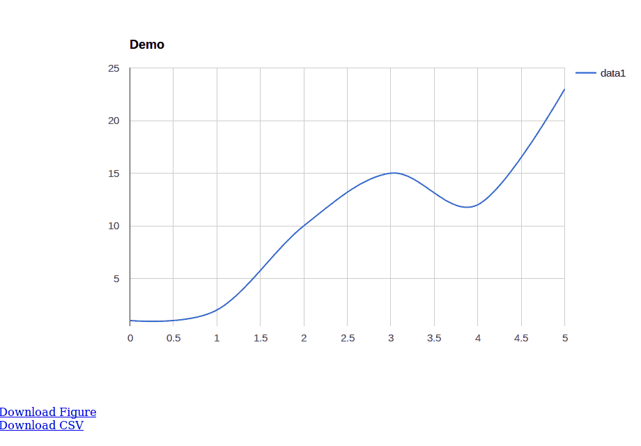
>>> my_plot = figure(title='Demo')>>> my_plot.plot([1, 2, 10, 15, 12, 23])
If you run this code, you should see your default browser pop open with the following image displayed:

You will note that you can download the figure as a PNG or save the data that made the chart as a CSV file. GooPyCharts also integrates with the Jupyter Notebook.
Creating a Bar Graph
The GooPyCharts package has a nice testGraph.py script included to help you learn how to use the package. Unfortunately it doesn’t actually demonstrate different types of charts. So I took one of the examples from there and modified it to create a bar chart:
from gpcharts import figure

fig3 = figure()
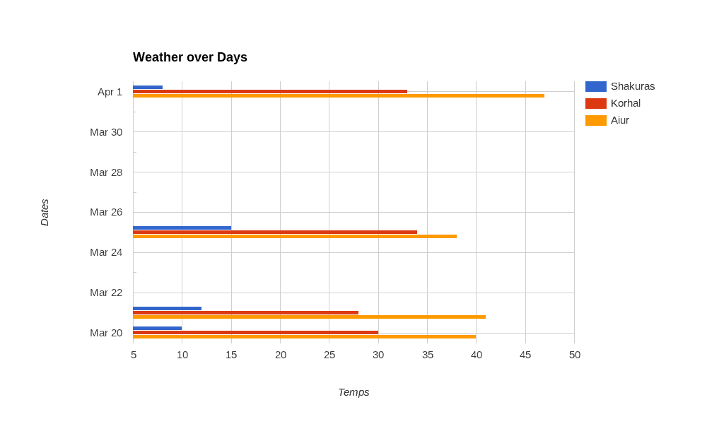
xVals = ['Temps','2016-03-20','2016-03-21','2016-03-25','2016-04-01']
yVals = [['Shakuras','Korhal','Aiur'],[10,30,40],[12,28,41],[15,34,38],[8,33,47]]
fig3.title = 'Weather over Days'
fig3.ylabel = 'Dates'
fig3.bar(xVals, yVals)
You will note that in this example we create our title using the figure instance’s title property. We also set the ylabel the same way. You can also see how to define dates for the chart as well as set an automatic legend using nested lists. Finally you can see that instead of calling plot we need to call bar to generate a bar chart. Here is the result:

Creating Other Types of Graphs
Let’s modify the code a bit more and see if we can create other types of graphs. We will start with a scatter plot:
from gpcharts import figure

my_fig = figure()
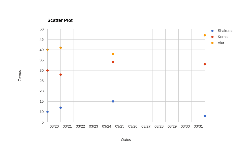
xVals = ['Dates','2016-03-20','2016-03-21','2016-03-25','2016-04-01']
yVals = [['Shakuras','Korhal','Aiur'],[10,30,40],[12,28,41],[15,34,38],[8,33,47]]
my_fig.title = 'Scatter Plot'
my_fig.ylabel = 'Temps'
my_fig.scatter(xVals, yVals)
Here we can most of the same data that we used in the last example. We just need to modify a few values to make the X and Y labels work correctly and we need to title the graph with something that makes sense. When you run this code, you should see something like this:

That was pretty simple. Let’s try creating a quick and dirty histogram:
from gpcharts import figure

my_fig = figure()
my_fig.title = 'Random Histrogram'
my_fig.xlabel = 'Random Values'
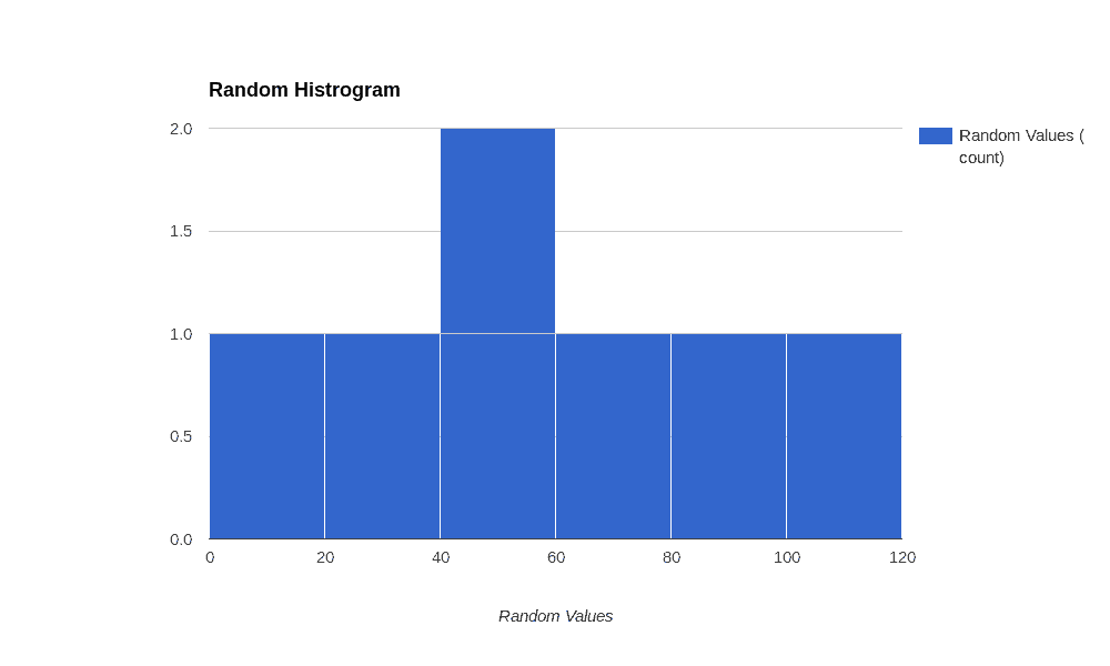
vals = [10, 40, 30, 50, 80, 100, 65]
my_fig.hist(vals)
The histogram is much simpler than the last two charts we created as it only needs one list of values to create it successfully. This is what I got when I ran the code:

This is a pretty boring looking histogram, but it’s extremely easy to modify it and add a more realistic set of data.
Wrapping Up
While this was just a quick run-through of some of GooPyCharts capabilities, I think we got a pretty good idea of what this charting package is capable of. It’s really easy to use, but only has a small set of charts to work with. PyGal, Bokeh and matplotlib have many other types of charts that they can create. However if you are looking for something that’s super easy to install and use and you don’t mind the small set of charts it supports, then GooPyCharts may be just the right package for you!
Related Reading
- Python: Visualization with Bokeh
- Using pyGal Graphs in Flask
- wxPython: PyPlot – Graphs with Python