When doing a bit of good old data exploration and analysis you'll often want ways of visually representing this data. It helps you understand what you're working with, and allows you to present your exciting new discoveries to other people in easy-to-digest formats that even the data illiterate can understand (if those people even exist now-a-days).
Some data has a location associated with them. Things like per city/country populations or general election votes and the like can be bound to a location somewhere. If you have data like this then being able to plot, or represent this data somehow on a map can be of massive help. It allows you to spot trends in areas and visually recognise groups in your data as well as being a fantastic method of communicating your results to people.
If you are doing your data analysis in Python, then lucky you; representing your data on a map is a fairly simple task. In this post we will go into just how we do this and by the end will have a pretty little map to communicate our data to the masses.
To follow along with this post, you should have basic knowledge of Pandas and Matplotlib, but if you don't, don't worry because you can go and check out my Pandas and Matplotlib tutorials to learn everything you need for this post and more.
To follow along with this post, you should have basic knowledge of Pandas and Matplotlib, but if you don't, don't worry because you can go and check out my Pandas and Matplotlib tutorials to learn everything you need for this post and more.
THE TOOL OF THE TRADE - BASEMAP
The tool that we will be using to create our map visualisation is Matplotlib Basemap. Now this tool is actually not part of the Matplotlib package, so you'll have to install it separately.
I hope for your sake that you are using Anaconda; if you are you can simply run the command conda install basemap. If you are not using Anaconda, then you are going to have to spend a bit of time manually installing it. You can find information on how to manually install Basemap here.
DRAWING A BASIC MAP
OK! Now we have Basemap installed and ready to use, we can get going and draw our first map. To draw a map in Basemap you first need to know a few things:
- Where you want your map to be centred
- The latitude and longitude of the lower left corner of the bounding box around the area you want to map.
- The latitude and longitude of the upper right corner of the bounding box around the area you want to map.
- Instead of the corners of the bounding box you can also use the width and height of the area you want to map in metres.
Now you may be wondering 'how hell am I supposed to know all that stuff?'. Well, I've got you covered there.
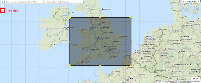
First go to this very useful website and you will be presented with a world map. In the top left corner of the map there is a button with a cursor icon on, click that and draw a box around the area you want to map.
At the bottom there is a box with some longitude and latitudes in. To the left of that there is a drop down menu, click that and select DublinCore; this is the easiest format to understand in my opinion and it's in a form that can be directly used in Basemap. The first two numbers labeled 'westlimit' and 'southlimit' are the latitude and longitude of your lower left corner. The other two, labelled 'eastlimit' and 'northlimit' are the latitude and longitude of your upper right corner.
Now we have the information we need to be able to draw our map, we can get to writing some code and actually producing a basic map. Now note that in this post the data I will be using to plot points and such on a map is the 2015 England and Wales Property prices and so I will be drawing the UK. I will provide links to all the data I used in this visualisation, but by all means use your own and make a completely different map. In fact, I recommend you do!
First we will import the packages that we will be using.
First we will import the packages that we will be using.
import matplotlib.pyplot as plt
import matplotlib.cm

from mpl_toolkits.basemap import Basemap
from matplotlib.patches import Polygon
from matplotlib.collections import PatchCollection
from matplotlib.colors import Normalize
Next we will create a figure to draw our map on and set its size.
We can create our map with the below code.
Now, there are a fair amount of arguments here, but they are all pretty easy to understand. The 'resolution' argument is the quality of the map you are creating. The options are crude, low, intermediate, high or full. The higher the resolution the longer it takes to render the map, and it can take a very long time so I recommend that while you are working on your map, set it to crude, and then if and when you want to publish it set it to full.
The 'projection' is the type of map that you want to draw. There are lots of types that you can use that all have different use cases so I recommend you take a look at the available ones here.
The 'lat_0' and 'lon_0' are the latitude and longitude of the centre point of your map. The other arguments are the latitudes and longitudes of your bounding box corners. 'llcrnr' stands for 'lower left corner' and 'urcrnr' stands for upper right corner. Fill these in with the latitudes and longitudes that you got earlier.
Now we just need to define how the map is to be displayed and we have our basic map.
With the drawmapboundary() function we can set the colour of the seas and oceans on our map. Here I have set it to a light blue colour. The fillcontinents() function does just as it suggests, this is the colour of land masses. I have set them to a light-grey colour and have set lakes to the same colour as I set the sea. Finally the drawcoastlines() function draws lines around the land masses.
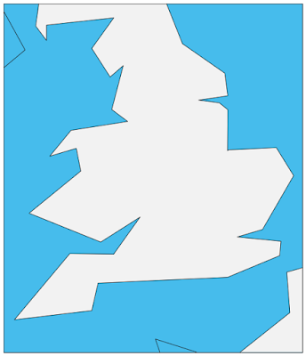
You should now have a map looking a bit like this. Obviously the area will be different if you chose a different place and the colours will vary too if you changed those. Also note that this map has been drawn using the crude setting.
fig, ax = plt.subplots(figsize=(10,20))
We can create our map with the below code.
m = Basemap(resolution='c', # c, l, i, h, f or None
            projection='merc',
            lat_0=54.5, lon_0=-4.36,
            llcrnrlon=-6., llcrnrlat= 49.5, urcrnrlon=2., urcrnrlat=55.2)
Now, there are a fair amount of arguments here, but they are all pretty easy to understand. The 'resolution' argument is the quality of the map you are creating. The options are crude, low, intermediate, high or full. The higher the resolution the longer it takes to render the map, and it can take a very long time so I recommend that while you are working on your map, set it to crude, and then if and when you want to publish it set it to full.
The 'projection' is the type of map that you want to draw. There are lots of types that you can use that all have different use cases so I recommend you take a look at the available ones here.
The 'lat_0' and 'lon_0' are the latitude and longitude of the centre point of your map. The other arguments are the latitudes and longitudes of your bounding box corners. 'llcrnr' stands for 'lower left corner' and 'urcrnr' stands for upper right corner. Fill these in with the latitudes and longitudes that you got earlier.
Now we just need to define how the map is to be displayed and we have our basic map.
m.drawmapboundary(fill_color='#46bcec')
m.fillcontinents(color='#f2f2f2',lake_color='#46bcec')
m.drawcoastlines()
With the drawmapboundary() function we can set the colour of the seas and oceans on our map. Here I have set it to a light blue colour. The fillcontinents() function does just as it suggests, this is the colour of land masses. I have set them to a light-grey colour and have set lakes to the same colour as I set the sea. Finally the drawcoastlines() function draws lines around the land masses.
You should now have a map looking a bit like this. Obviously the area will be different if you chose a different place and the colours will vary too if you changed those. Also note that this map has been drawn using the crude setting.
PLOTTING DATA POINTS ONTO A MAP
We now have our map, but what we really want to do is to use it to communicate our data, so let's plot some points on it.
Now as mentioned before I will be using England and Wales property price data. You can download this data here. I also have done a bit of data analysis and manipulation on this that you will also need to do if you want to produce the same map as me. I'm not going to go into what I did here as it doesn't fit the scope of this post, but the notebook that I did this all in can be found here. I will be plotting newly built houses.
Plotting points onto a Basemap map is very easy. A few things to note about the below code though, are that my data is stored in a Pandas DataFrame called new_areas, the location of these areas are in new_areas.pos and the number of newly built houses in that area is in new_areas.count.
What we are doing here is making a function that takes a position and then plots the number of new houses associated with that position onto our map represented by the size of the point. Then using apply() on our Pandas DataFrame's pos column we go through every position in our DataFrame and plot them onto our map.
You should end up with something along the lines of this:
Don't worry about the points in the sea, that's just because on a crude map the shape is not perfect. When we finish up and render our map with full resolution they will be safely on land.
Now as mentioned before I will be using England and Wales property price data. You can download this data here. I also have done a bit of data analysis and manipulation on this that you will also need to do if you want to produce the same map as me. I'm not going to go into what I did here as it doesn't fit the scope of this post, but the notebook that I did this all in can be found here. I will be plotting newly built houses.
Plotting points onto a Basemap map is very easy. A few things to note about the below code though, are that my data is stored in a Pandas DataFrame called new_areas, the location of these areas are in new_areas.pos and the number of newly built houses in that area is in new_areas.count.
def plot_area(pos):
    count = new_areas.loc[new_areas.pos == pos]['count']
    x, y = m(pos[1], pos[0])
    size = (count/1000) ** 2 + 3
    m.plot(x, y, 'o', markersize=size, color='#444444', alpha=0.8)

new_areas.pos.apply(plot_area)
What we are doing here is making a function that takes a position and then plots the number of new houses associated with that position onto our map represented by the size of the point. Then using apply() on our Pandas DataFrame's pos column we go through every position in our DataFrame and plot them onto our map.
You should end up with something along the lines of this:
Don't worry about the points in the sea, that's just because on a crude map the shape is not perfect. When we finish up and render our map with full resolution they will be safely on land.
USING SHAPEFILES TO DRAW AREAS AND REGIONS
Now we have a map that can transmit information, but what if we want to represent regions or specific areas on our map. For example in the we have UK counties or in the USA, states. We can do this using shapefiles. I will be drawing in England and Wales postcode boundaries using the shapefile which can be found here.This is actually just a one-liner; nice and simple.
m.readshapefile('data/uk_postcode_bounds/Areas', 'areas')
The first argument is the path to your shapefile. The second is the name that will be used to access your shapefile. Here I will be able to access the data from the shapefile using m.areas.
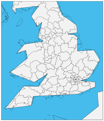
You should now have a map like this:
Again, don't worry about the shapefile not matching up with the map, it's because we have the map's resolution set to crude.
USING DATA TO COLOUR IN AREAS
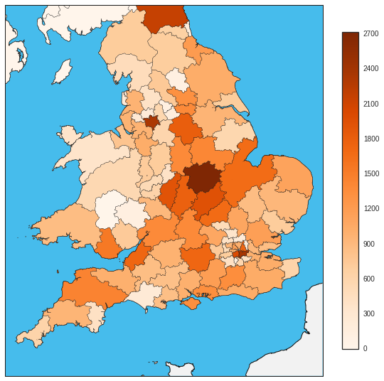
Now we have areas drawn onto our map, wouldn't it be nice to be able to use our data to colour them in. For example in my case, the higher the number of new houses in an area, the darker the colour of the area. We'll also add a colour bar in to give people looking at the map an idea of what kind of number a colour represents.
First we are going to create a new DataFrame for convenience that will hold all the information we need.
First we are going to create a new DataFrame for convenience that will hold all the information we need.
df_poly = pd.DataFrame({
        'shapes': [Polygon(np.array(shape), True) for shape in m.areas],
        'area': [area['name'] for area in m.areas_info]
    })
df_poly = df_poly.merge(new_areas, on='area', how='left')
Here we are getting the polygons from our shapefile that we imported earlier. Also, my shapefile contained the names of each area too, which we also add to the new DataFrame. We then merge the the two DataFrames on the area column which adds the other information about the areas that we need.
Next we need to use this information to colour in the areas.
First we create a colormap to use with our map and data. I like orange so that's what I'm going to go with, you can find other colormaps here.
We then create a PatchCollection using the shapes from our shapefile which are now stored in the DataFrame that we previously made. The 'zorder' argument just makes sure that the patches that we are creating end up on top of the map, not underneath it.
Next for convenience we create a variable for the function Normalize() which we then use when setting the PatchCollections facecolor. We colour the patches with our colormap that we created before and pass it our normalised new houses count data. This makes it so that now patches with high new property counts are a darker colour than those with low new property counts.
Finally we add the PatchCollection to our map.
That's it, we now have a map that uses our data to colour in areas. There is one more thing that we should do however. Add a colorbar, this makes it at lot easier to interpret the colours of the map and relate them to a number.
First we create a ScalarMappable object and use the set_array() function to add our counts to it. We then pass it to Matplotlib's colorbar() function and set the shrink argument to 0.4 in order to make the colorbar smaller than the map and we are done.
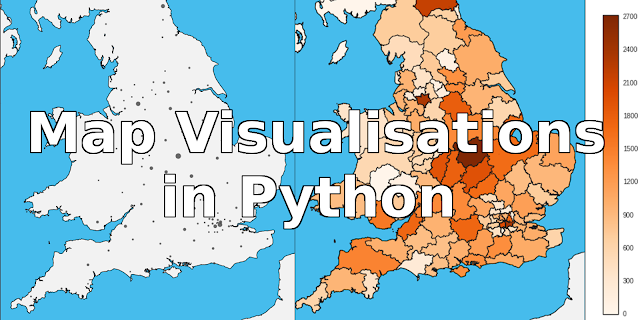
Change the maps resolution to 'f' for full and you should now have a attractive and informative map visualisation written in Python with Matplotlib and Basemap that will look something like this:
To see all this code together in action, you can go here.
Remember to share this post so that other people can read it too and to subscribe to this blogs mailing list, follow me on twitter and add me on Google+ so you don't miss any useful posts!
Also, if you make or have made a map please by all means comment on this post with a link to wherever we can find it, I'd love to see what other people come up with.
Next we need to use this information to colour in the areas.
cmap = plt.get_cmap('Oranges')
pc = PatchCollection(df_poly.shapes, zorder=2)
norm = Normalize()

pc.set_facecolor(cmap(norm(df_poly['count'].fillna(0).values)))
ax.add_collection(pc)
First we create a colormap to use with our map and data. I like orange so that's what I'm going to go with, you can find other colormaps here.
We then create a PatchCollection using the shapes from our shapefile which are now stored in the DataFrame that we previously made. The 'zorder' argument just makes sure that the patches that we are creating end up on top of the map, not underneath it.
Next for convenience we create a variable for the function Normalize() which we then use when setting the PatchCollections facecolor. We colour the patches with our colormap that we created before and pass it our normalised new houses count data. This makes it so that now patches with high new property counts are a darker colour than those with low new property counts.
Finally we add the PatchCollection to our map.
That's it, we now have a map that uses our data to colour in areas. There is one more thing that we should do however. Add a colorbar, this makes it at lot easier to interpret the colours of the map and relate them to a number.
mapper = matplotlib.cm.ScalarMappable(norm=norm, cmap=cmap)

mapper.set_array(df_poly['count'])
plt.colorbar(mapper, shrink=0.4)
First we create a ScalarMappable object and use the set_array() function to add our counts to it. We then pass it to Matplotlib's colorbar() function and set the shrink argument to 0.4 in order to make the colorbar smaller than the map and we are done.
Change the maps resolution to 'f' for full and you should now have a attractive and informative map visualisation written in Python with Matplotlib and Basemap that will look something like this:
To see all this code together in action, you can go here.
Remember to share this post so that other people can read it too and to subscribe to this blogs mailing list, follow me on twitter and add me on Google+ so you don't miss any useful posts!
Also, if you make or have made a map please by all means comment on this post with a link to wherever we can find it, I'd love to see what other people come up with.
