One of the most popular uses for Python, especially in recent years is data processing, analysis and visualisation. This then leads topics such as the analysis of 'big data' which has many applications in pretty much every type of business you can imagine, and a personal interest of mine; Machine Learning.
Python has a vast array of powerful tools available to help with this processing, analysis and visualisation of data and is one of the main reasons that Python has gained such momentum in the scientific world.
In this series of posts, we will take a look at the main libraries used in scientific Python and learn how to use them to bend data to our will. We won't just be learning to churn out template code however, we will also learn a bit of the maths behind it so that we can understand what is going on a little better.
So let's kick things off with a incredibly useful little number that we will be using throughout this series of posts; Matplotlib.
WHAT IS MATPLOTLIB?
Simply put it's a graphing library for Python. It has a humongous array of tools that you can use to create anything from simple scatter plots, to sin curves, to 3D graphs. It is used heavily in the scientific Python community for data visualisation.
You can read more about the ideas behind Matplotlib on their website, but I especially recommend taking a look at their gallery to see the amazing things you can pull off with this library.
You can read more about the ideas behind Matplotlib on their website, but I especially recommend taking a look at their gallery to see the amazing things you can pull off with this library.
PLOTTING A SIMPLE GRAPH
To get started we will plot a simple sin wave from 0 to 2 pi. You will notice that we are using Numpy here, don't worry too much about it for now if you don't know how to use it; we will be covering Numpy in the next post.
import matplotlib.pyplot as plt
import numpy as np
These are the imports we will be using. As I've mentioned in a previous post (and others) the 'from x import *' way of importing is not good. We don't want to be typing out matplotlib.pyplot and numpy all the time though, they are long, so we will use the above compromise.
# Basic plotting.
x = np.linspace(0, 2 * np.pi, 50)
plt.plot(x, np.sin(x)) # Without the first x, array indices will be used on the x axis.
plt.show() # Show the graph.
The above code will produce a simple sin curve. The 'np.linspace(0, 2 * np.pi, 50)' bit of code produces an array of 50 evenly spaced numbers from 0 to 2 pi.
The plot command is the short and sweet line of code that actually creates the graph. Note that without the first x argument used here, instead of the x axis going fro 0 to 2 pi, it would instead use the array indices used in the x variable instead.
The final bit of code plt.show() displays the graph, without this nothing will appear.
You will get something like this:
PLOTTING TWO DATASETS ON ONE GRAPH
A lot of the time you will want to plot more than one dataset on a graph. In Matplotlib this is simple.
# Plotting two data sets on one graph.
x = np.linspace(0, 2 * np.pi, 50)
plt.plot(x, np.sin(x),
        x, np.sin(2 * x))
plt.show()
The above code plots both the graphs for sin(x) and sin(2x). It is pretty much the same as the previous code for plotting one dataset, except this time inside the same plt.plot() call, we define another dataset separated by a comma.
You will end up with a graph with two lines on like this:
You will end up with a graph with two lines on like this:
CUSTOMISING THE LOOK OF LINES
When having multiple datasets on one graph it is useful to be able to change the look of the plotted lines to make differentiating between the datasets easier.
# Customising the look of lines.
x = np.linspace(0, 2 * np.pi, 50)
plt.plot(x, np.sin(x), 'r-o',
        x, np.cos(x), 'g--')
plt.show()
In the above code you can see two examples of different line stylings; 'r-o' and 'g--'. The letters 'r' and 'g' are the line colours and the following symbols are the line and marker styles. For example '-o' creates a solid line with dots on and '--' creates a dashed line. As with most of the aspects of Matplotlib, the best thing to do here is play.
You will end up with something like this:
Colours:
Blue - 'b'
Green - 'g'
Red - 'r'
Cyan - 'c'
Magenta - 'm'
Yellow - 'y'
Black - 'k' ('b' is taken by blue so the last letter is used)
White - 'w'
Lines:
Solid Line - '-'
Dashed - '--'
Dotted - '.'
Dash-dotted - '-:'
Often Used Markers:
Point - '.'
Pixel - ','
Circle - 'o'
Square - 's'
Triangle - '^'
For more markers click here.
You will end up with something like this:
USING SUBPLOTS
Subplots allow you to plot multiple graphs in one window.
# Using subplot.
x = np.linspace(0, 2 * np.pi, 50)
plt.subplot(2, 1, 1) # (row, column, active area)
plt.plot(x, np.sin(x), 'r')
plt.subplot(2, 1, 2)
plt.plot(x, np.cos(x), 'g')
plt.show()
When using subplots, we plot datasets as in the previous examples but with one extra step. Before calling the plot() function, we first call the subplot() function. The first argument is the number of rows you want the subplot to have, the second is the number of columns and the third is the active area.
The active area is the current subplot you are working on now and are numbered from left to right, up to down. For example in a 4x4 grid of subplots, the active area 6 would be (2,2) on the grid.
You should have two graphs like this:
The active area is the current subplot you are working on now and are numbered from left to right, up to down. For example in a 4x4 grid of subplots, the active area 6 would be (2,2) on the grid.
You should have two graphs like this:
SIMPLE SCATTER GRAPHS
Scatter graphs are a collection of points that are not connected by a line. Again, Matplotlib makes this a trivial task.
# Simple scatter plotting.
x = np.linspace(0, 2 * np.pi, 50)
y = np.sin(x)
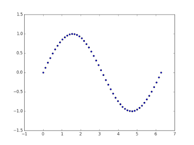
plt.scatter(x,y)
plt.show()
As the above code shows, all you do is call the scatter() function and pass it two arrays of x and y coordinates. Note that this can also be reproduced by using the plot command with the line styling 'bo'.
You should end up with a graph with no line like so:
You should end up with a graph with no line like so:
COLOUR MAP SCATTER GRAPHS
Another graph you might want to produced is a colour mapped scatter graph. Here we will vary the colour and the size of each point according to the data and add a colour bar too.
# Colormap scatter plotting.
x = np.random.rand(1000)
y = np.random.rand(1000)
size = np.random.rand(1000) * 50
colour = np.random.rand(1000)
plt.scatter(x, y, size, colour)
plt.colorbar()
plt.show()
In the above code you can see np.random.rand(1000) a lot, the reason for this is that we are simply randomly generating data to plot.
As before we use the same scatter() function, but this time pass it an extra two arguments, the size and the colour of the point we want to plot. By doing this, the points plotted on the graph will vary in size and colour depending on the data we pass.
We then add a colour bar with the function colorbar().
You will end up with a colourful scatter graph that will look something like this:
HISTOGRAMS
Histograms are another type of graph that are used frequently and again can be created with very few lines of code.
# Histograms
x = np.random.randn(1000)
plt.hist(x, 50)
plt.show()
A histogram is one of the simplest types of graphs to plot in Matplotlib. All you need to do is pass the hist() function an array of data. The second argument specifies the amount of bins to use. Bins are intervals of values that our data will fall into. The more bins, the more bars.
You will now have a histogram like the following:
You will now have a histogram like the following:
TITLES, LABELS AND LEGENDS
When quickly bringing up graphs for your own sake, you might not always need to label your graphs. However, when producing a graph that will be shown to other people, adding titles, labels and legends is a must.
# Adding a title, axis labels and legend.
x = np.linspace(0, 2 * np.pi, 50)
plt.plot(x, np.sin(x), 'r-x', label='Sin(x)')
plt.plot(x, np.cos(x), 'g-^', label='Cos(x)')
plt.legend() # Display the legend.
plt.xlabel('Rads') # Add a label to the x-axis.
plt.ylabel('Amplitude') # Add a label to the y-axis.
plt.title('Sin and Cos Waves') # Add a graph title.
plt.show()
To add legends to our graph, inside the plot() function we add the named argument 'label' and assign it what we want the line to be labelled with. We then call the legend() function and a legend will be placed on our graph.
To add a title and labels all we have to do is use the self explanatory title(), xlabel() and ylabel() functions and we are done.
To add a title and labels all we have to do is use the self explanatory title(), xlabel() and ylabel() functions and we are done.
You should now have a titled, labelled and legended graph like this:
This should be enough to get you going with visualisation of data using Matplotlib and Python, but is by no means exhaustive. One thing I strongly recommend you to do, as it really helped me get to grips with this tool, is to just play. Plot a few graphs, play with styling and subplots and you will know your way around Matplotlib in no time at all.
This has been a post on data visualisation with Matplotlib and Python, the first in series of posts on scientific Python. I hope you have managed to learn something and feel more comfortable with the Matplotlib library now. Make sure you share this post so others can read and benefit from it too! Also don't forget to follow me on Twitter or add me on Google+ so you don't miss any future posts.


