Introduction
Deep learning is one of the most interesting and promising areas of artificial intelligence (AI) and machine learning currently. With great advances in technology and algorithms in recent years, deep learning has opened the door to a new era of AI applications.
In many of these applications, deep learning algorithms performed equal to human experts and sometimes surpassed them.
Python has become the go-to language for Machine Learning and many of the most popular and powerful deep learning libraries and frameworks like TensorFlow, Keras, and PyTorch are built in Python.
In this article, we'll be performing Exploratory Data Analysis (EDA) on a dataset before Data Preprocessing and finally, building a Deep Learning Model in Keras and evaluating it.
Why Keras?
Keras is a deep learning API built on top of TensorFlow. TensorFlow is an end-to-end machine learning platform that allows developers to create and deploy machine learning models. TensorFlow was developed and used by Google; though it released under an open-source license in 2015.
Keras provides a high-level API for TensorFlow. It makes it really easy to build different types of machine learning models while taking the benefits of TensorFlow's infrastructure and scalability.
It allows you to define, compile, train, and evaluate deep learning models using simple and concise syntax as we will see later in this series.
Keras is very powerful; it is the most used machine learning tool by top Kaggle champions in the different competitions held on Kaggle.
House Price Prediction with Deep Learning
We will build a regression deep learning model to predict a house price based on the house characteristics such as the age of the house, the number of floors in the house, the size of the house, and many other features.
In the first article of the series, we'll be importing the packages and data and doing some Exploratory Data Analysis (EDA) to get familiar with the dataset we're working with.
Importing the Required Packages
In this preliminary step, we import the packages needed in the next steps:
import tensorflow as tf
from tensorflow import keras
from tensorflow.keras import layers
import pandas as pd
import numpy as np
import matplotlib.pyplot as plt
import seaborn as sns
We're importing tensorflow which includes Keras and some other useful tools. For code brevity, we're importing keras and layers separately so instead of tf.keras.layers.Dense we can write layers.Dense.
We're also importing pandas and numpy which are extremely useful and widely used to store and handle the data as well as manipulate it.
And for visualizing and exploring the data, we import plt from the matplotlib package and seaborn. Matplotlib is a fundamental library for visualization, while Seaborn makes it much simpler to work with.
Loading the Data
For this tutorial, we will work with a dataset that reports sales of residential units between 2006 and 2010 in a city called Ames which is located in Iowa, United States.
For each sale, the dataset describes many characteristics of the residential unit and lists the sale price of that unit. This sale price will be the target variable that we want to predict using the different characteristics of the unit.
The dataset actually contains a lot of characteristics data on each unit including the unit area, the year in which the unit was built, the size of the garage, the number of kitchens, the number of bathrooms, the number of bedrooms, the roof style, the type of the electrical system, the class of the building, and many others.
You can read more about the dataset on this page on Kaggle.
To download the exact dataset file that we will be using in this tutorial, visit its Kaggle page and click on the download button. This will download a CSV file containing the data.
We'll rename this file to AmesHousing.csv and load it inside our program using Pandas' read_csv() function:
df = pd.read_csv('AmesHousing.csv')
The loaded dataset contains 2,930 rows (entries) and 82 columns (characteristics). Here's a truncated view of only a few rows and columns:
| Order | PID | MS SubClass | MS Zoning | Lot Frontage | Lot Area | Street | |
| 0 | 1 | 526301100 | 20 | RL | 141 | 31770 | Pave |
| 1 | 2 | 526350040 | 20 | RH | 80 | 11622 | Pave |
| 2 | 3 | 526351010 | 20 | RL | 81 | 14267 | Pave |
As we said earlier, each row describes a residential unit sale by specifying many characteristics of the unit and its sale price. And, again, to get more information about the meaning of each variable in this dataset, please visit this page on Kaggle.
Before we proceed, we will remove some features (columns) from the dataset because they don't provide any useful information to the mode. These features are Order and PID:
df.drop(['Order', 'PID'], axis=1, inplace=True)
Exploratory Data Analysis (EDA)
Exploratory Data Analysis (EDA) helps us understand the data better and spot patterns in it. The most important variable to explore in the data is the target variable: SalePrice.
A machine learning model is as good as the training data - you want to understand it if you want to understand your model. The first step in building any model should be good data exploration.
Since the end-goal is predicting house values, we'll focus on the SalePrice variable and the variables that have high correlation with it.
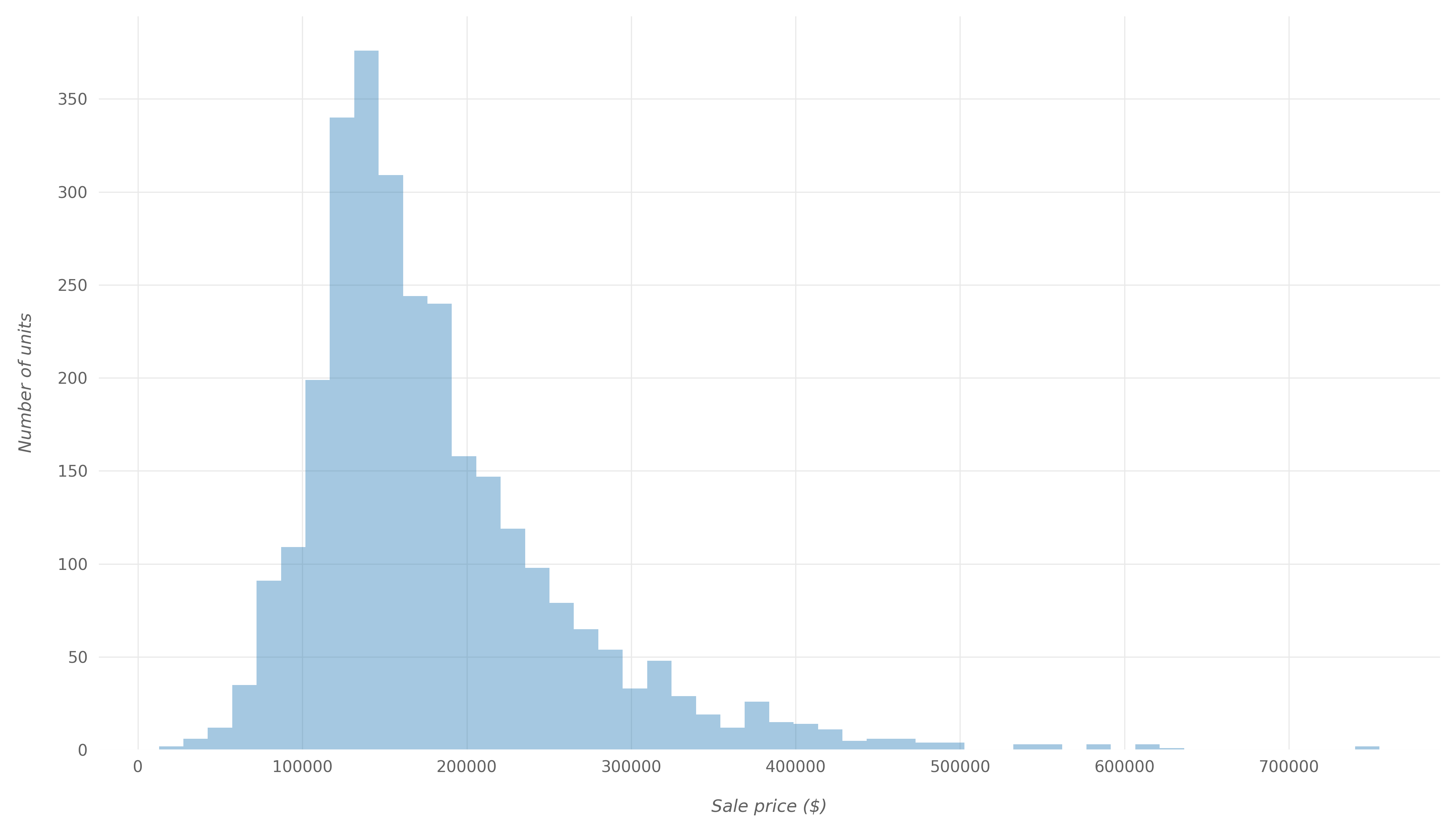
Sale Price Distribution
First, let's take a look at the distribution of SalePrice. Histograms are a great and simple way to take a look at distributions of variables. Let's use Matplotlib to plot a histogram that displays the distribution of the SalePrice:
fig, ax = plt.subplots(figsize=(14,8))
sns.distplot(df['SalePrice'], kde=False, ax=ax)
The image below shows the resulting histogram after applying some formatting to enhance the appearance:
We can also look at the SalePrice distribution using different types of plots. For example, let's make a swarm plot of SalePrice:
fig, ax = plt.subplots(figsize=(14,8))
sns.swarmplot(df['SalePrice'], color='#2f4b7c', alpha=0.8, ax=ax)
This would result in:
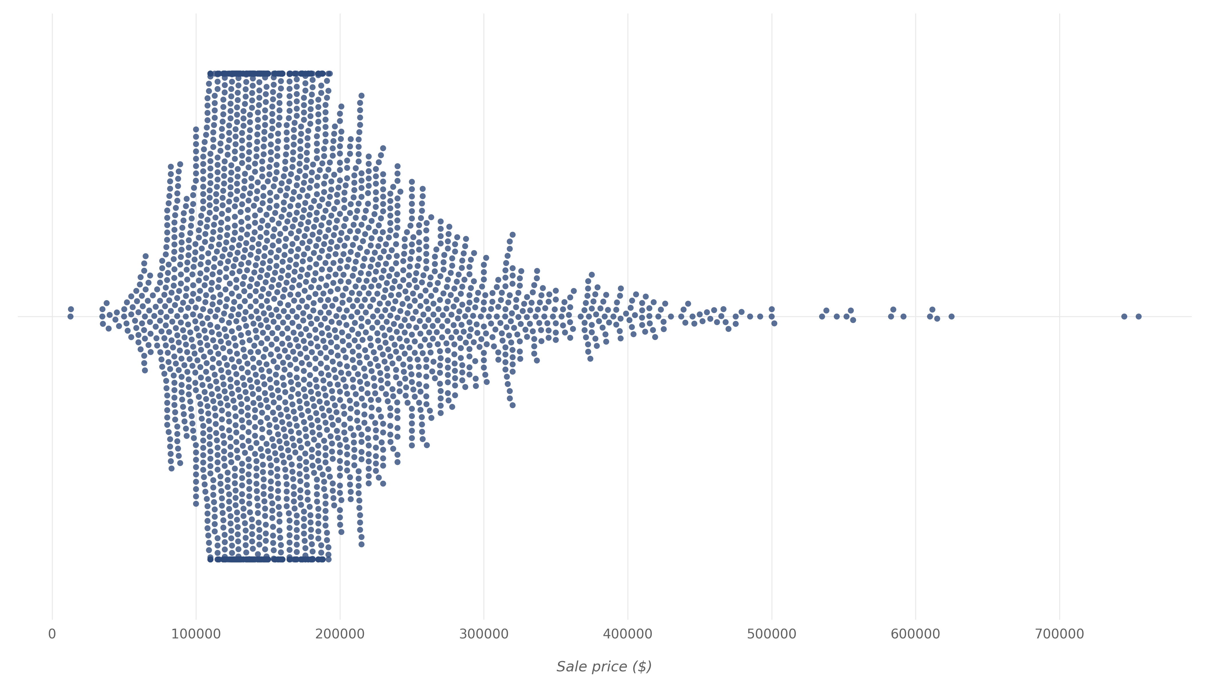
By looking at the histogram and swarm plot above, we can see that for most units, the sale price ranges from $100,000 to $200,000. If we generate a description of the SalePrice variable using Pandas' describe() function:
print(df['SalePrice'].describe().apply(lambda x: '{:,.1f}'.format(x)))
We'll receive:
count      2,930.0
mean     180,796.1
std       79,886.7
min       12,789.0
25%      129,500.0
50%      160,000.0
75%      213,500.0
max      755,000.0
Name: SalePrice, dtype: object
From here, we know that:
- The average sale price is $180,796
- The minimum sale price is $12,789
- The maximum sale price is $755,000
Correlation with Sale Price
Now, let's see how predictor variables in our data correlate with the target SalePrice. We will calculate these correlation values using Pearson's method and then visualize the correlations using a heatmap:
fig, ax = plt.subplots(figsize=(10,14))
saleprice_corr = df.corr()[['SalePrice']].sort_values(
  by='SalePrice', ascending=False)
sns.heatmap(saleprice_corr, annot=True, ax=ax)
And here is the heatmap that shows how predictor variables are correlated with SalePrice.
Lighter colors in the map indicate higher positive correlation values and darker colors indicate lower positive correlation values and sometimes negative correlation values:
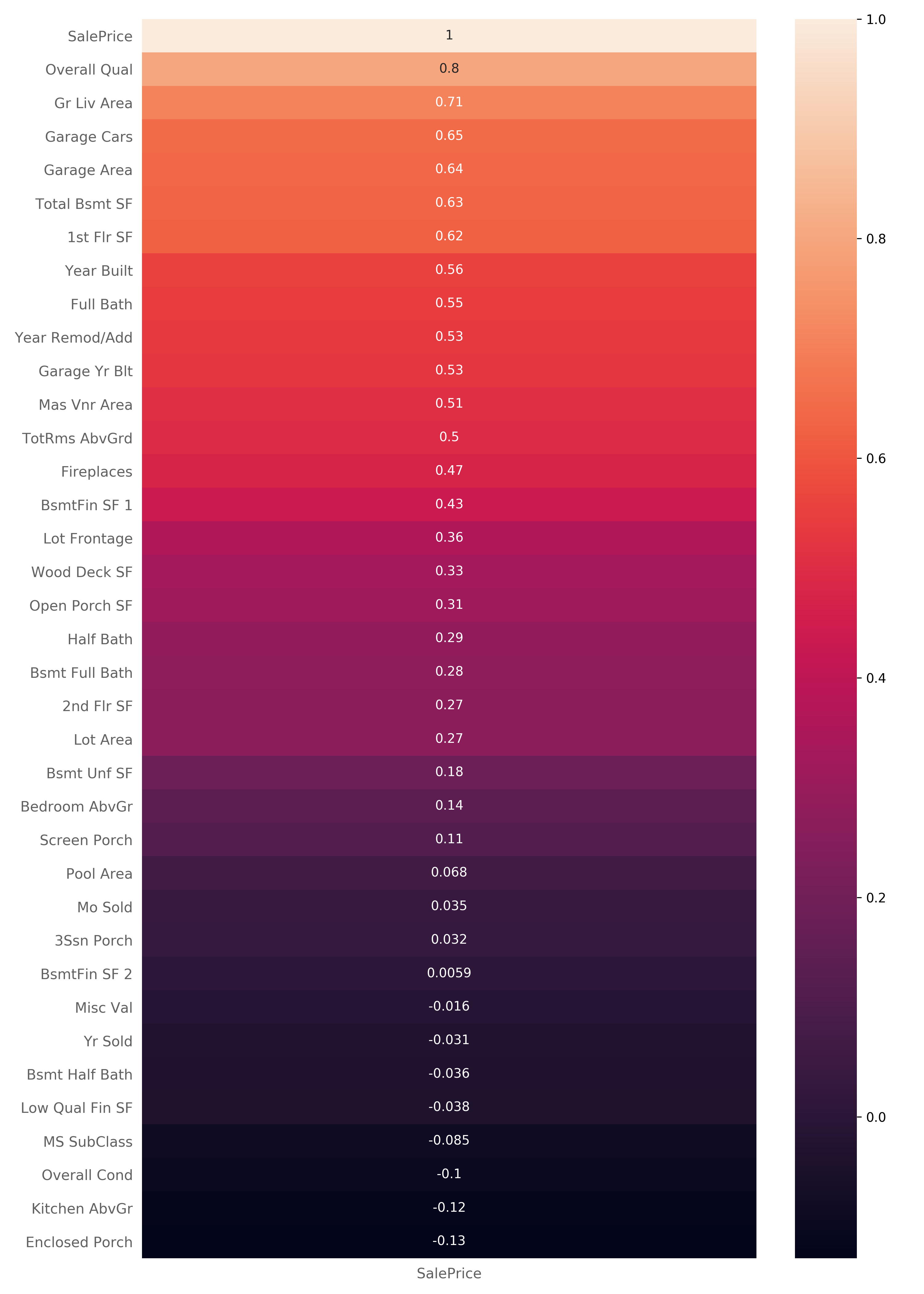
Obviously, the SalePrice variable has a 1:1 correlation with itself. Though, there are some other variables that are highly correlated with the SalePrice that we can draw some conclusions from.
For example, we can see that SalePrice is highly correlated with the Overall Qual variable which describes the overall quality of material and finish of the house. We can also see a high correlation with Gr Liv Area which specifies the above-ground living area of the unit.
Examining the Different Correlation Degrees
Now that we have some variables that are highly correlated with SalePrice in mind, let's examine the correlations more deeply.
Some variables are highly correlated with the SalePrice, and some aren't. By checking these out, we can draw conclusions on what's prioritized when people are buying properties.
High Correlation
First, let's look at two variables that have high positive correlation with SalePrice - namely Overall Qual which has a correlation value of 0.8 and Gr Liv Area which has a correlation value of 0.71.
Overall Qual represents the overall quality of material and finish of the house. Let's explore their relationship further by plotting a scatter plot, using Matplotlib:
fig, ax = plt.subplots(figsize=(14,8))
ax.scatter(x=df['Overall Qual'], y=df['SalePrice'], color="#388e3c",
           edgecolors="#000000", linewidths=0.1, alpha=0.7);
plt.show()
Here is the resulting scatter plot:
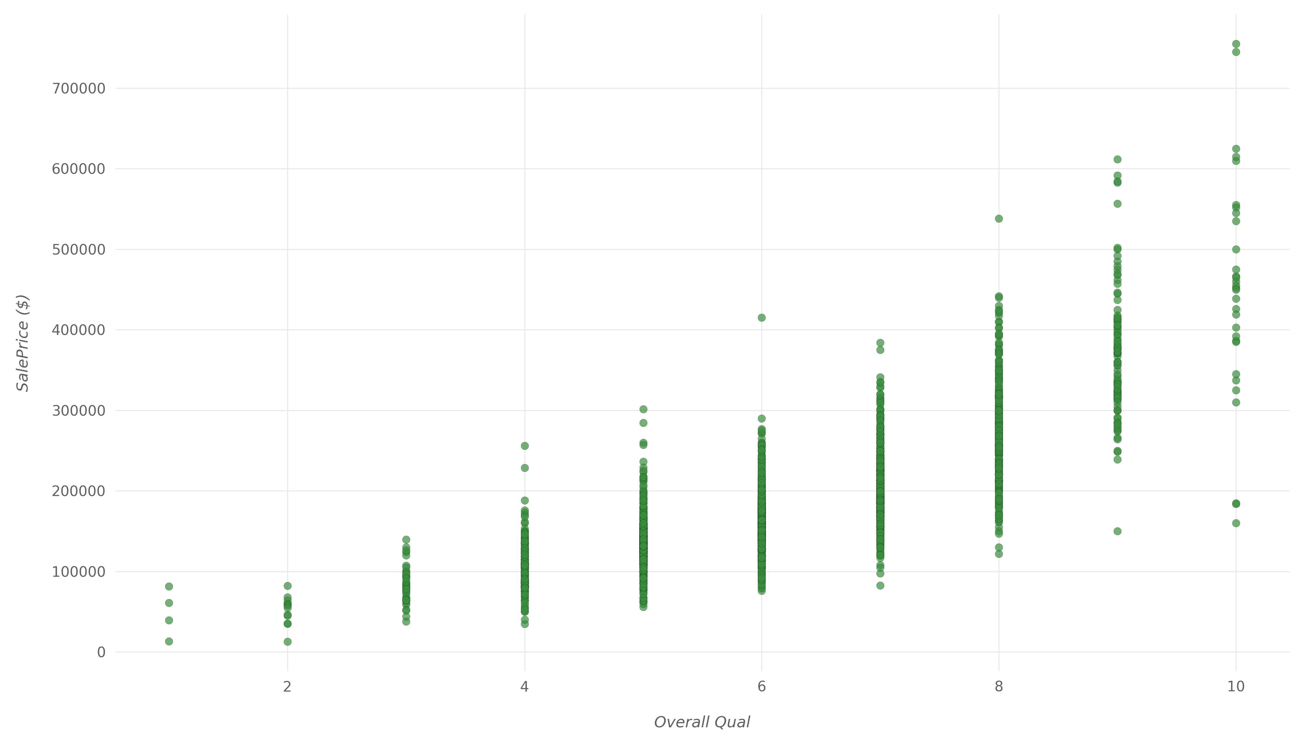
We can clearly see that as the overall quality increases, the house sale price tends to increase as well. The increase isn't quite linear, but if we drew a trendline, it would be relatively close to linear.
Now, let's see how Gr Liv Area and SalePrice relate to each other with another scatter plot:
fig, ax = plt.subplots(figsize=(14,8))
ax.scatter(x=df['Gr Liv Area'], y=df['SalePrice'], color="#388e3c",
           edgecolors="#000000", linewidths=0.1, alpha=0.7);
plt.show()
Here is the resulting scatter plot:
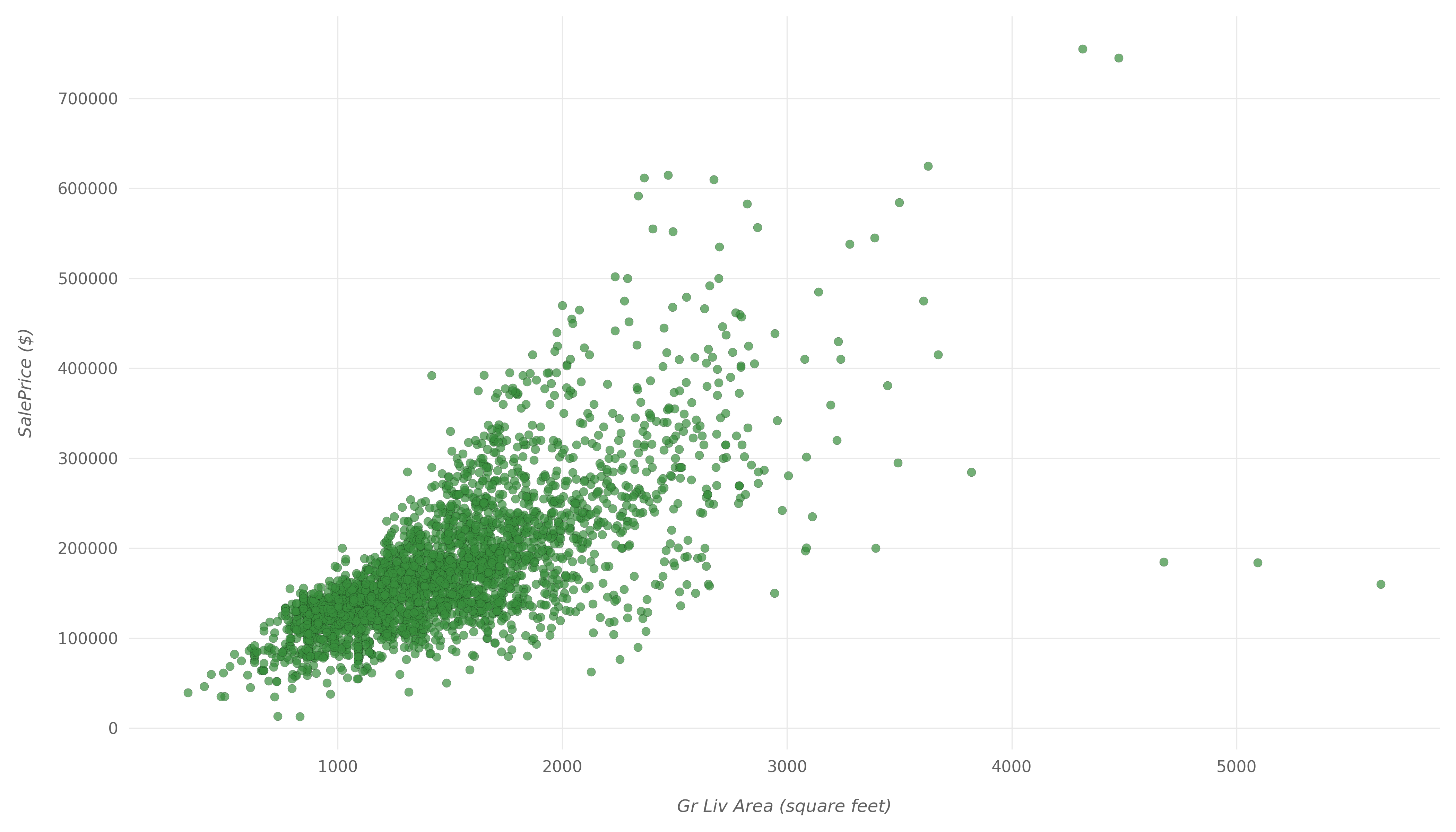
Again, we can clearly see the high positive correlation between Gr Liv Area and SalePrice in this scatter plot. They tend to increase with each other, with a few outliers.
Moderate Correlation
Next, let's look at variables that have a moderate positive correlation with SalePrice. We will look at Lot Frontage which has a correlation value of 0.36 and Full Bath which has a correlation value of 0.55.
Lot Frontage represents the length of the lot in front of the house, all the way to the street. And Full Bath represents the number of full bathrooms above ground.
Similar to what we have done with Overall Qual and Gr Liv Area, we will plot two scatter plots to visualize the relationships between these variables and the SalePrice.
Let's start with Lot Frontage:
fig, ax = plt.subplots(figsize=(14,8))
ax.scatter(x=df['Lot Frontage'], y=df['SalePrice'], color="orange",
           edgecolors="#000000", linewidths=0.5, alpha=0.5);
plt.show()
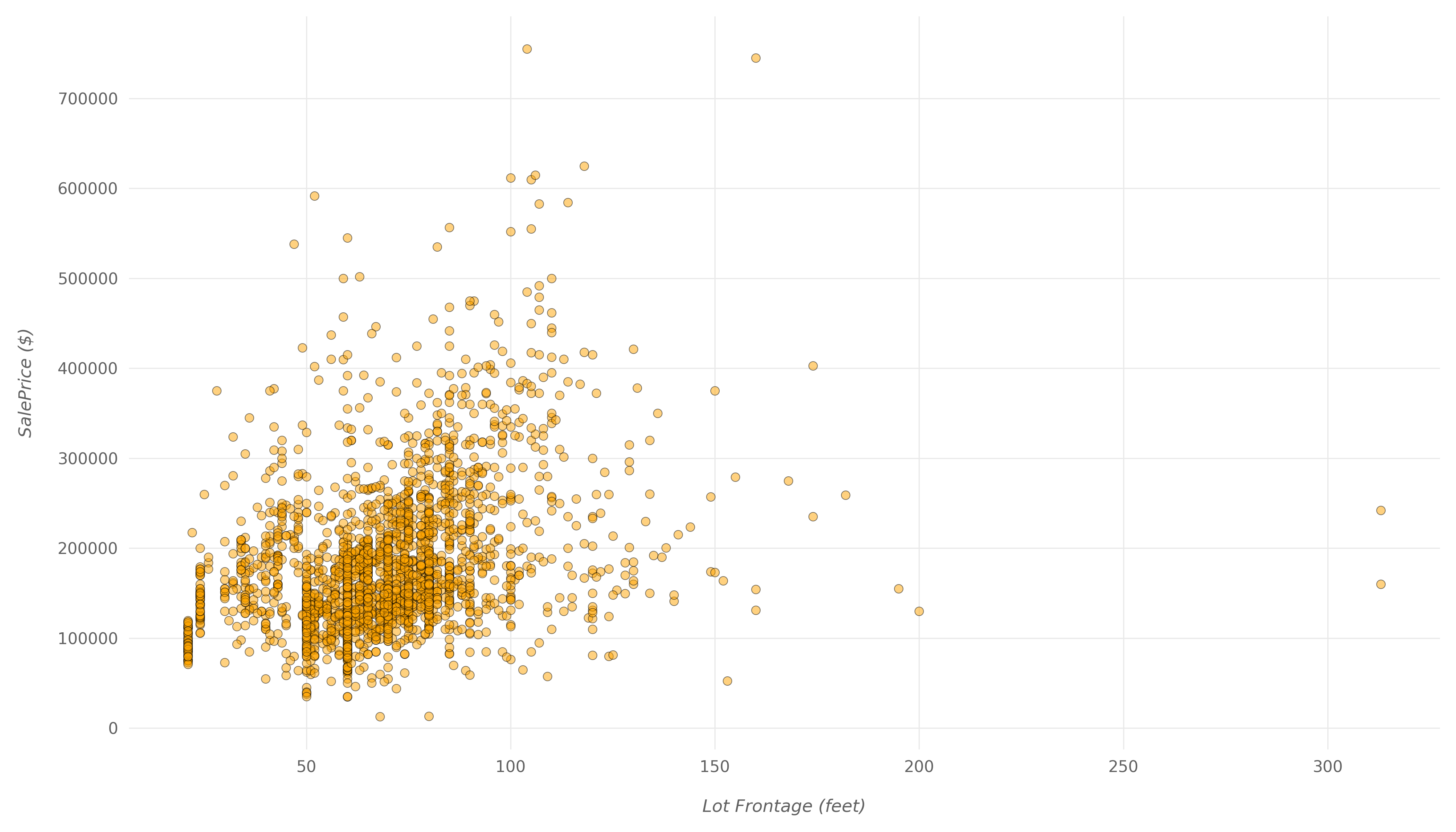
Here, you can see a much weaker correlation. Even with larger lots in front of the properties, the price doesn't go up by much. There is a positive correlation between the two, but it doesn't seem to be as important to buyers as some other variables.
Then, let's show the scatter plot for Full Bath:
fig, ax = plt.subplots(figsize=(14,8))
ax.scatter(x=df['Full Bath'], y=df['SalePrice'], color="orange",
           edgecolors="#000000", linewidths=0.5, alpha=0.5);
plt.show()
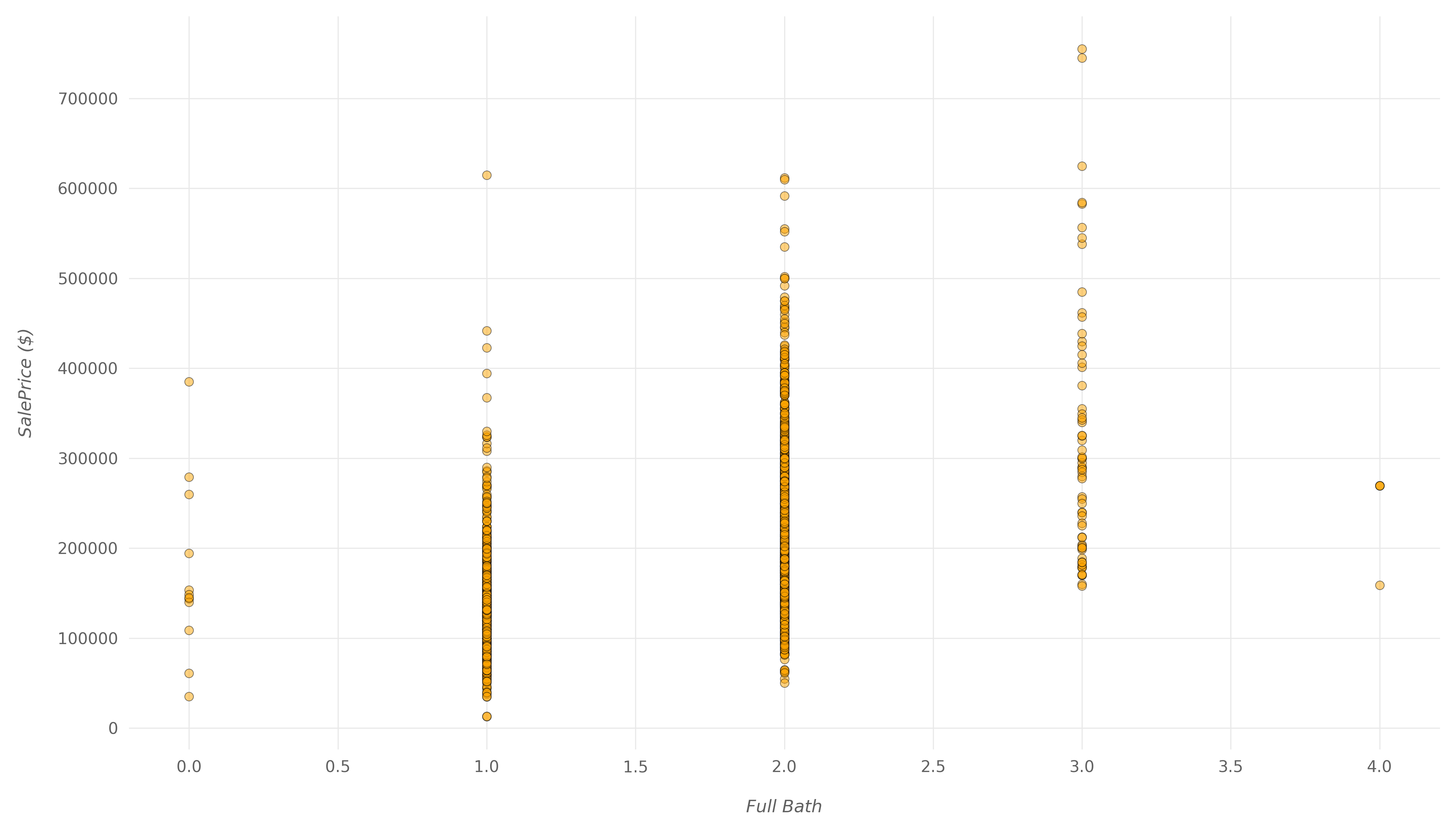
Here, you can also see a positive correlation, which isn't that weak, but also isn't too strong. A good portion of houses with two full bathrooms have the exact same price as the houses with only one bathroom. The number of bathrooms does influence the price, but not too much.
Low Correlation
Finally, let's look at variables that have a low positive correlation with SalePrice and compare them with what we saw so far. We will look at Yr Sold which has a correlation value of -0.031 and Bsmt Unf SF which has a correlation value of 0.18.
Yr Sold represents the year in which the house was sold. And Bsmt Unf SF represents the unfinished basement area in square feet.
Let's start with Yr Sold:
fig, ax = plt.subplots(figsize=(14,8))
ax.scatter(x=df['Yr Sold'], y=df['SalePrice'], color="#b71c1c",
           edgecolors="#000000", linewidths=0.1, alpha=0.5);
ax.xaxis.set_major_formatter(
  ticker.FuncFormatter(func=lambda x,y: int(x)))
plt.show()
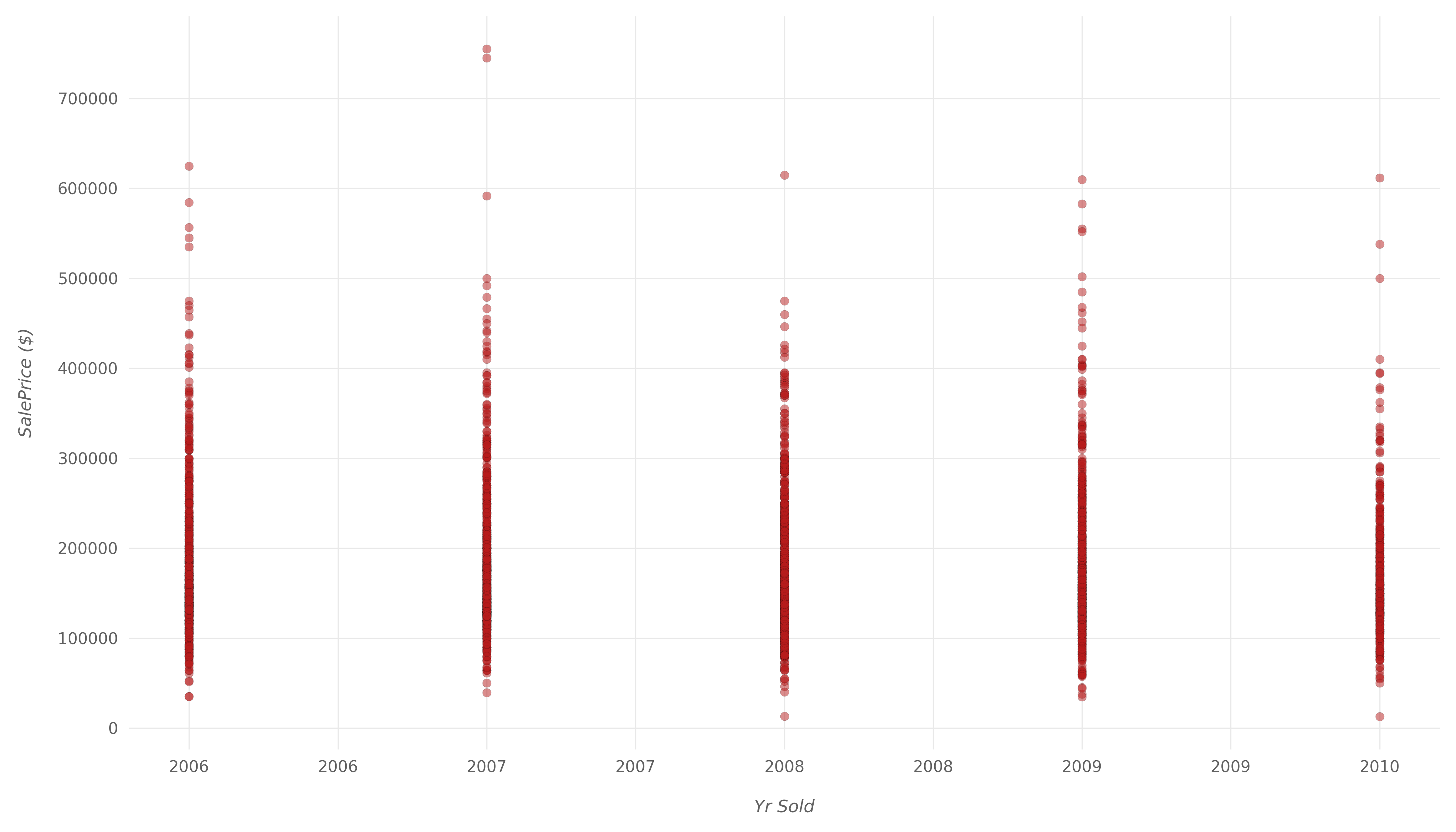
The correlation here is so weak that it's fairly safe to assume that there's basically no correlation between these two variables. It's safe to assume that the prices of properties haven't changed much between 2006 and 2010.
Let's also make a plot for Bsmt Unf SF:
fig, ax = plt.subplots(figsize=(14,8))
ax.scatter(x=df['Bsmt Unf SF'], y=df['SalePrice'], color="#b71c1c",
           edgecolors="#000000", linewidths=0.1, alpha=0.5);
plt.show()
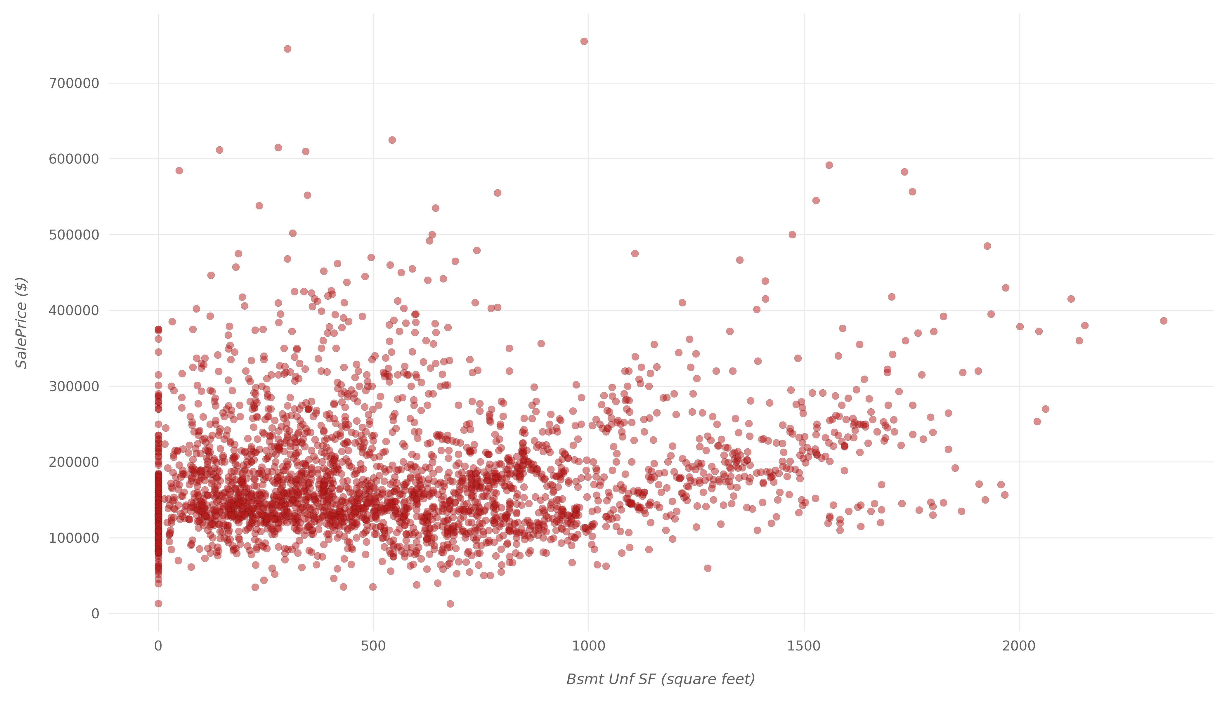
Here, we can see some properties with lower Bsmt Unf SF being sold for higher than ones with a high value. Then again, this could be due to pure chance, and there isn't an apparent correlation between the two.
It's safe to assume that Bsmt Unf SF doesn't have much to do with the SalePrice.
Conclusion
In this article, we've made the first steps in most machine learning projects. We started off with downloading and loading in a dataset that we're interested in.
Then, we've performed Exploratory Data Analysis on the data to get a good understanding of what we're dealing with. A machine learning model is as good as the training data - you want to understand it if you want to understand your model.
Finally, we've chosen a few variables and checked for their correlation with the main variable we're eyeing - the SalePrice variable.