Data visualization is a big part of the process of data analysis. In this post, we will learn how make a scatter plot using Python and the package Seaborn. In detail, we will learn how to use the Seaborn methods scatterplot, regplot, lmplot, and pairplot to create scatter plots in Python.
More specifically, we will learn how to make scatter plots, change the size of the dots, change the markers, the colors, and change the number of ticks. Furthermore, we will learn how to plot a regression line, add text, plot a distribution on a scatter plot, among other things. Finally, we will also learn how to save Seaborn plots in high resolution. That is, we learn how to make print-ready plots.
Scatter plots are powerful data visualization tools that can reveal a lot of information. Thus, this Python scatter plot tutorial will start explain what they are and when to use them. After we done that, we will learn how to make scatter plots.
What is a Scatter Plot
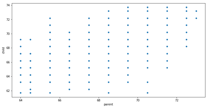
A scatter plot is a two-dimensional (bivariate) data visualization that uses dots to represent the values gathered for two different variables. That is, one of the variables is plotted along the x-axis and the other plotted along the y-axis. For example, this scatter plot shows the relationship between a child’s height and the parents height.
When to Use a Scatter Plot
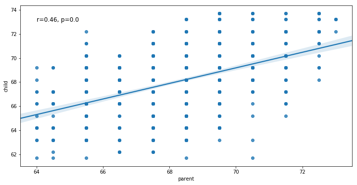
Scatter plots are used when we want to visualize the relationship between two variables. Furthermore, scatter plots are sometimes called correlation plots because they reveal how two variables are correlated. In the child and parent height example, the chart wasn’t just a simple log of the height of a set of children and parents, but it also visualized the relationship between a child’s height and it’s parents height. That is, namely that the child’s height increases as the parents height increases. Notice that the relationship isn’t perfect, some children are shorter than their parents. However, this trend is general and relatively pretty strong. Using Python and Seaborn we can also visualize this trend and correlation:
Python Scatter Plot Tutorial
This is exactly what we are going to learn in this tutorial; how to make a scatter plot using Python and Seaborn.
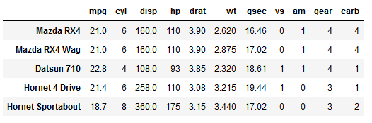
In the first code chunk, below, we are importing the packages we are going to use. Furthermore, to get data to visualize (i.e., create scatter plots) we load this from an URL. Note, the %matplotlib inline code is only needed if we want to display the scatter plots in a Jupyter Notebook. This is also the case for the import warnings and warnings.filterwarnings(‘ignore’) part of the code.
%matplotlib inline
import numpy as np
import pandas as pd
import seaborn as sns

# Suppress warningsimport warnings
warnings.filterwarnings('ignore')

# Import Data
data = 'https://vincentarelbundock.github.io/Rdatasets/csv/datasets/mtcars.csv'
df = pd.read_csv(data, index_col=0)

df.head()![]() How to use Seaborn to create Scatter Plots in Python
How to use Seaborn to create Scatter Plots in Python
In this section we will learn how to make scatter plots using Seaborns scatterplot, regplot, lmplot, and pairplot methods.
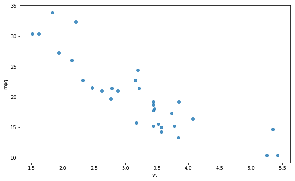
Seaborn Scatter plot using the scatterplot method
First, we start with the most obvious method to create scatter plots using Seaborn: using the scatterplot method. In the first Seaborn scatter plot example, below, we plot the variables wt (x-axis) and mpg (y-axis). This will give us a simple scatter plot:
sns.scatterplot(x='wt', y='mpg', data=df)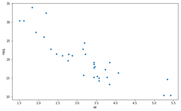
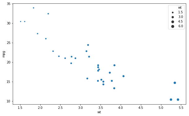
Size of the dots
If we want to have the size of the dots represent one of the variables this is possible. In the next example, we change the size of the dots using the size argument.
sns.scatterplot(x='wt', y='mpg',
size='wt', data=df)![]() Change the Axis
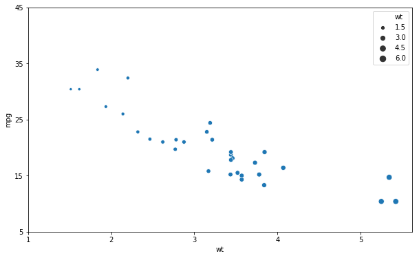
Change the Axis
In the next Seaborn scatter plot example we are going to learn how to change the ticks on the x- and y-axis’. That is, we are going to change the number of ticks on each axis. To do this we use the set methods and use the arguments xticks and yticks:
ax = sns.scatterplot(x='wt', y='mpg', size='wt', data=df)
ax.set(xticks=np.arange(1, 6, 1),
yticks=np.arange(5, 50, 10))![]() Grouped Scatter Plot in Seaborn
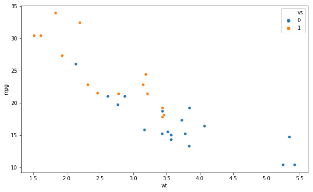
Grouped Scatter Plot in Seaborn
If we have a categorical variable (i.e., a factor) and want to group the dots in the scatter plot we use the hue argument:
sns.scatterplot(x='wt', y='mpg',
hue='vs', data=df)![]() Changing the Markers (the dots)
Changing the Markers (the dots)
Now, one way to change the look of the markers is to use the style argument.
data = 'https://vincentarelbundock.github.io/Rdatasets/csv/carData/Burt.csv'
df = pd.read_csv(data, index_col=0)
sns.scatterplot(x='IQbio', y='IQfoster', style='class',
hue='class', data=df)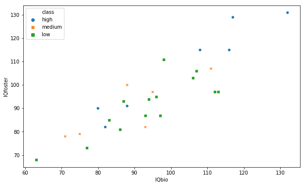 Note, should also be possible to use the markers argument. However, it seems not to work, right now.
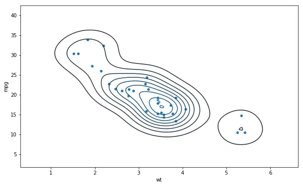
Bivariate Distribution on Scatter plot
In the next Seaborn scatter plot example we are going to plot a bivariate distribution on top of our scatter plot. This is quite simple and after we have called the scatterplot method we use the kdeplot method:
data = 'https://vincentarelbundock.github.io/Rdatasets/csv/datasets/mtcars.csv'
df = pd.read_csv(data, index_col=0)

sns.scatterplot(x='wt', y='mpg', data=df)
sns.kdeplot(df.wt, df.mpg)![]() Seaborn Scatter plot using the regplot method
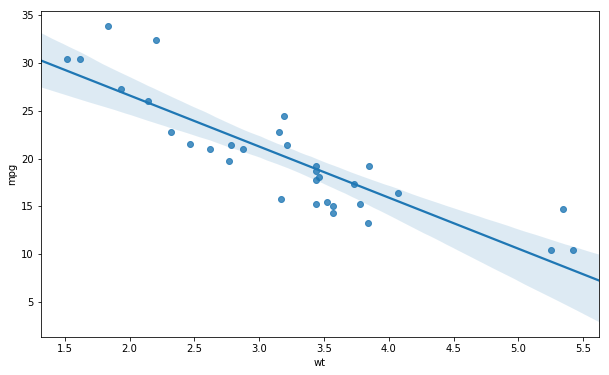
Seaborn Scatter plot using the regplot method
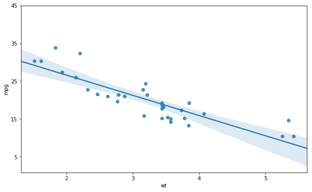
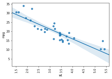
If we want a regression line (trend line) plotted on our scatter plot we can also use the Seaborn method regplot. In the first example, using regplot, we are creating a scatter plot with a regression line. Here, we also get the 95% confidence interval:
sns.regplot(x='wt', y='mpg', data=df)![]() Scatter Plot Without Confidence Interval
Scatter Plot Without Confidence Interval
We can also choose to create a scatter plot without the confidence interval. This is simple, we just add the ci argument and set it to None:
sns.regplot(x='wt', y='mpg',
ci=None, data=df)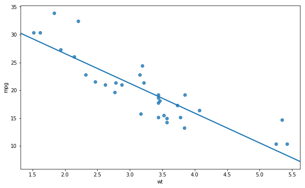 Note, the ci argument can also take a numerical value. That is, if we want a plot with 70% confidence interval we just change the ci=None to ci=70.
Seaborn regplot Without Regression Line
Furthermore, it’s possible to create a scatter plot without the regression line using the regplot method. In the next example, we just add the argument reg_fit and set it to False:
sns.regplot(x='wt', y='mpg',
fit_reg=False, data=df)![]() Changing the Number of Ticks
Changing the Number of Ticks
It’s also possible to change the number of ticks when working with Seaborn regplot. In fact, it’s as simple as working with the scatterplot method, we used earlier. To change the ticks we use the set method and the xticks and yticks arguments:
ax = sns.regplot(x='wt', y='mpg', data=df)
ax.set(xticks=np.arange(1, 6, 1),
      yticks=np.arange(5, 50, 10))
Changing the Color on the Scatterplot
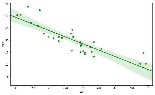
If we want to change the color of the plot, it’s also possible. We just have to use the color argument. In the regplot example below we are getting a green trend line and green dots:
sns.regplot(x='wt', y='mpg',
color='g', data=df) ![]() Adding Text to a Seaborn Plot
Adding Text to a Seaborn Plot
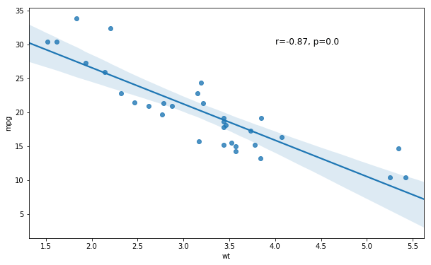
In the next example, we are going to learn how to add text to a Seaborn plot. Remember the plot, in the beginning, showing the relationship between children’s height and their parents height? In that plot there was a regression line as well as the correlation coeffienct and p-value. Here we are going to learn how to add this to a scatter plot. First, we start by using pearsonr to calculate the correlation between the variables wt and mpg:
from scipy.stats import pearsonr

corr = pearsonr(df['wt'], df['mpg'])
corr = [np.round(c, 2) for c in corr]
print(corr)
# Output: [-0.87, 0.0]
In the next code chunk we are creating a string variable getting our pearson r and p-value (corr[0] and corr[1], respectively). Next, we create the scatter plot with the trend line and, finally, add the text. Note, the first tow arguments are the coordinates where we want to put the text:
text = 'r=%s, p=%s' % (corr[0], corr[1])
ax = sns.regplot(x="wt", y="mpg", data=df)
ax.text(4, 30, text, fontsize=12)![]() Seaborn Scatter Plot with Trend Line and Density
Seaborn Scatter Plot with Trend Line and Density
It’s, of course, also possible to plot a bivariate distrubiton on the scatter plot with a regression line. In the final example, using Seaborn regplot we just add the kernel density estimation using Seaborn kde method:
import seaborn as sns

sns.regplot(x='wt', y='mpg',
            ci=None, data=df)
sns.kdeplot(df.wt, df.mpg)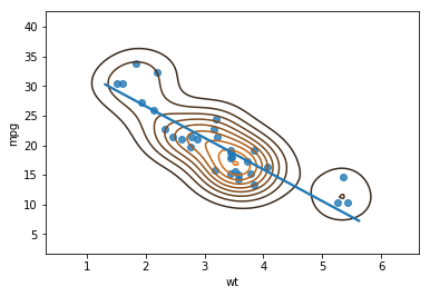
How to Rotate the Axis Labels on a Seaborn Plot
If the labels on the axis’ are long, we may want to rotate them for readability. It’s quite simple to rotate the axis labels on the regplot object. Here we rotatelabels on the x-axis 90 degrees:
ax = sns.regplot(x='wt', y='mpg', data=df)
for item in ax.get_xticklabels():
item.set_rotation(90)![]() Scatter Plot Using Seaborn lmplot Method
Scatter Plot Using Seaborn lmplot Method
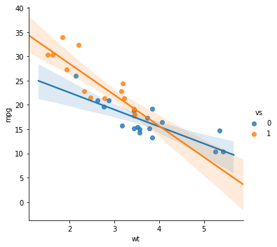
In this section we are going to cover Seaborn’s lmplot method. This method enables us create grouped Scatter plots with a regression line.
In the first example, we are just creating a Scatter plot with the trend lines for each group. Note, here we use the argument hue to set what varible we want to group by.
sns.lmplot(x='wt', y='mpg',
hue='vs', data=df)![]() Changing the Color Using the Palette Argument
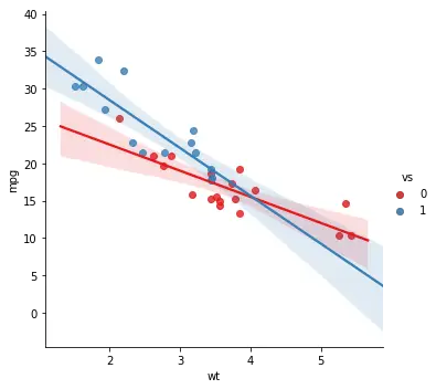
Changing the Color Using the Palette Argument
When working with Seaborn’s lmplot method we can also change the color of the lines, CIs, and dots using the palette argument. See here for different palettes to use.
sns.lmplot(x='wt', y='mpg', hue='vs',
palette="Set1", data=df)![]() Change the Markers on the lmplot
Change the Markers on the lmplot
As previously mentioned, when creating scatter plots, the markers can be changed using the markers argument. In the next Seaborn lmplot example we are changing the markers to crosses:
sns.lmplot(x='wt', y='mpg',
           hue='vs', palette="Set1", markers='+', data=df)
Furthermore, it’s also possible to change the markers of two, or more, categories. In the example below we use a list with the cross and “star” and get a plot with crosses and stars, for each gorup.
sns.lmplot(x='wt', y='mpg',
hue='vs',
palette="Set1", markers=['+', '*'], data=df)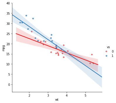 See here for different markers that can be used with Seaborn plots.
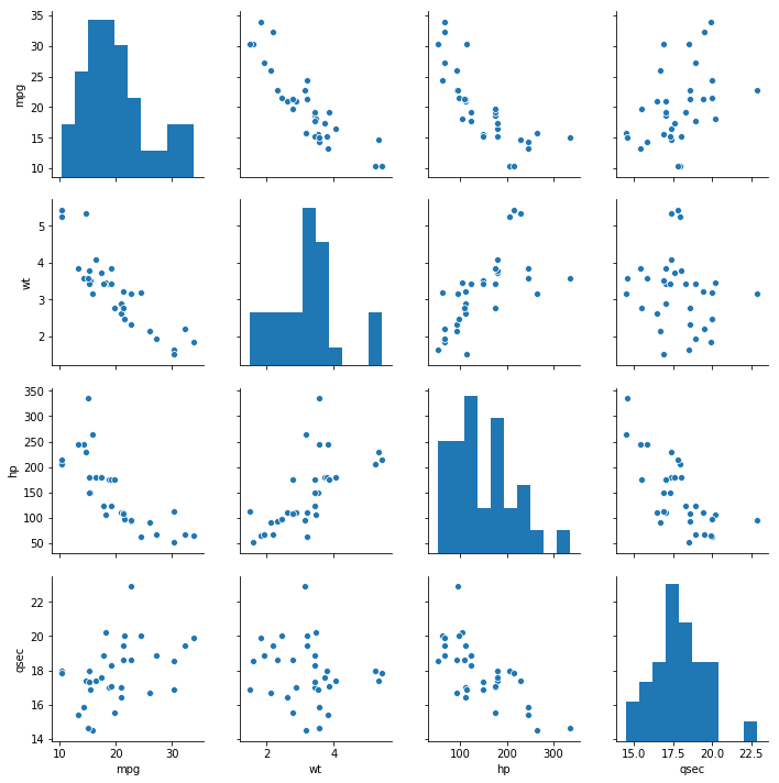
Seaborn Pairplot: Scatterplot + Histogram
In the last section, before learning how to save high resolution images, we are going to use Seaborn’s pairplot method. The pairplot method will create pairs of plots
data = 'https://vincentarelbundock.github.io/Rdatasets/csv/datasets/mtcars.csv'
df = pd.read_csv(data, index_col=0)
df = dfdf[['mpg', 'wt', 'hp', 'qsec']
sns.pairplot(df)![]() Pairplot with Grouped Data
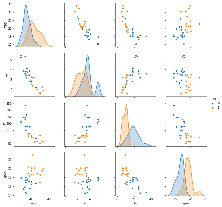
Pairplot with Grouped Data
If we want to group the data, with different colors for different categories, we can use the argument hue, also with pairplot. In this Python data visualization example we also use the argument vars with a list to select which variables we want to visualize:
cols = ['mpg', 'wt', 'hp', 'qsec']
sns.pairplot(df, vars=cols, hue='vs')
![]() Saving a High Resolution Plot in Python
Saving a High Resolution Plot in Python
If we are planning to publish anything we need to save the data visualization(s) to a high resolution file. In the last code example, below, we will learn how to save a high resolution image using Python and matplotlib.
ax = sns.pairplot(df, vars=cols, hue='vs')
plt.savefig('pairplot.eps', format='eps', dpi=300)
Here’s a link to a Jupyter Notebook containing all of the above code.
Conclusion
In this post we have larned how to make scatter plots in Seaborn. Moreover, we have also learned how to:
- work with the Seaborn’s scatterplot, regplot, lmplot, and pairplot methods
- change color, number of axis ticks, the markers, and how to rotate the axis labels of Seaborn plots
- save a high resolution, and print ready, image of a Seaborn plot
The post How to Make a Scatter Plot in Python using Seaborn appeared first on Erik Marsja.